Slack Inc
Sr Staff Designer / iOS, iPad & Android / Systems
Team and Culture: I joined Slack in 2020 as a Staff Product Designer, with the goal of leading all of Slack's mobile clients - iOS, Android, and iPad. It's been almost 4 years since, and I'm humbled by how far we've come on this journey.
Role: I oversaw mobile information architecture, scalability, systems, interaction designs, evangelizing mobile frameworks for 60+ designers, and building yearly vision for Slack Mobile. Few projects that I am particularly proud of are - Catch Up, Mobile IA Redesign, the iPad Redesign, Composer Modernization, & Low Connectivity.
The Ship of Theseus Moment
Every single pixel, on every single mobile screen updated to meet a higher quality bar - all with a nimble engineering and product team.
I believe we hit our "Ship of Theseus" moment within this timeframe.
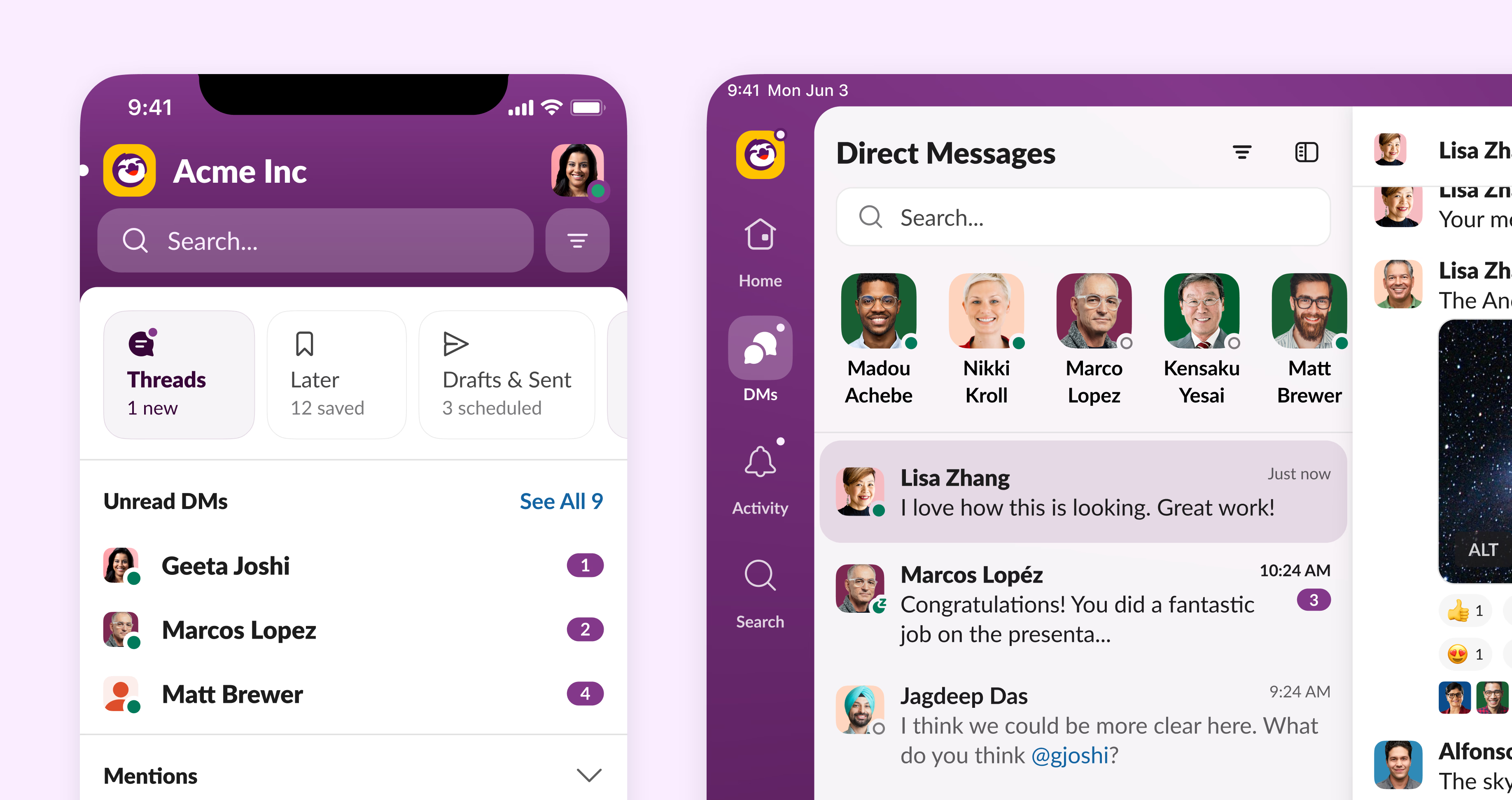
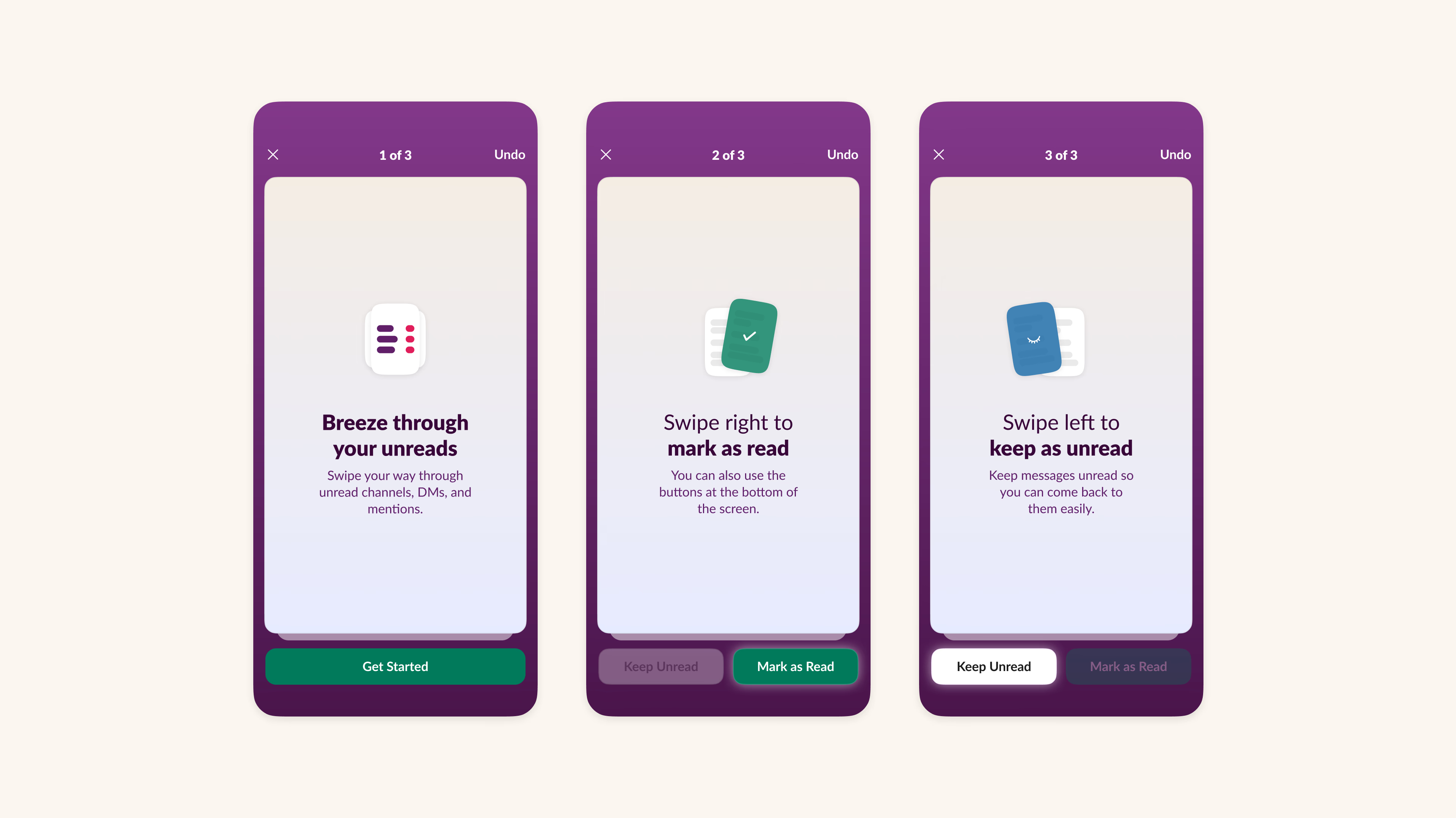
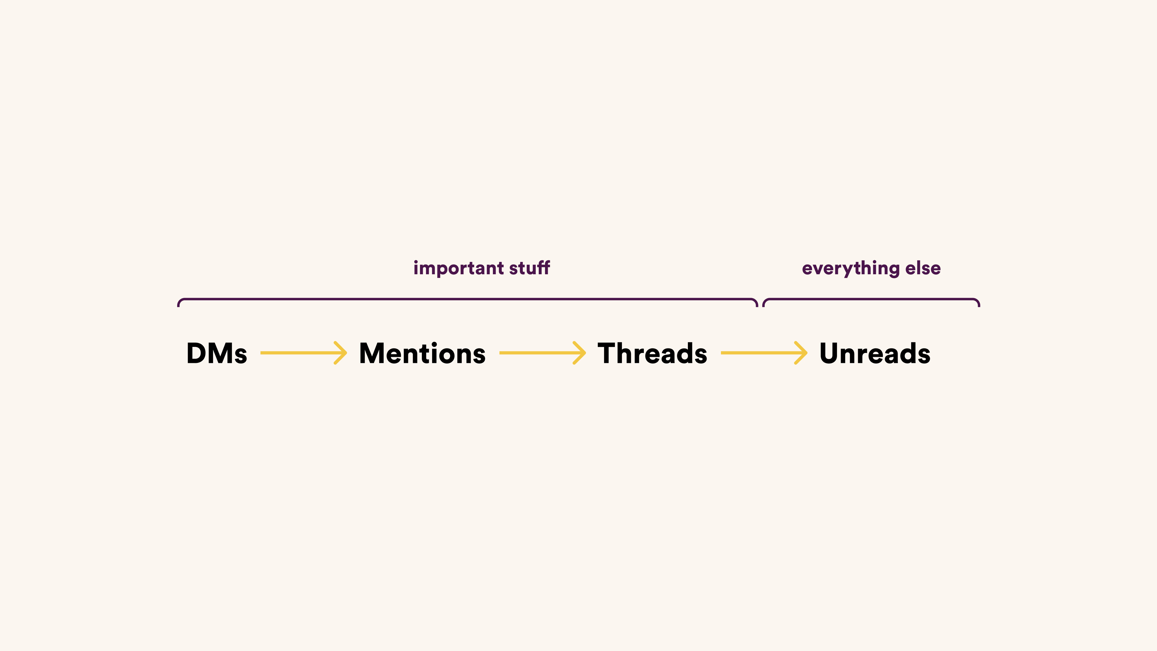
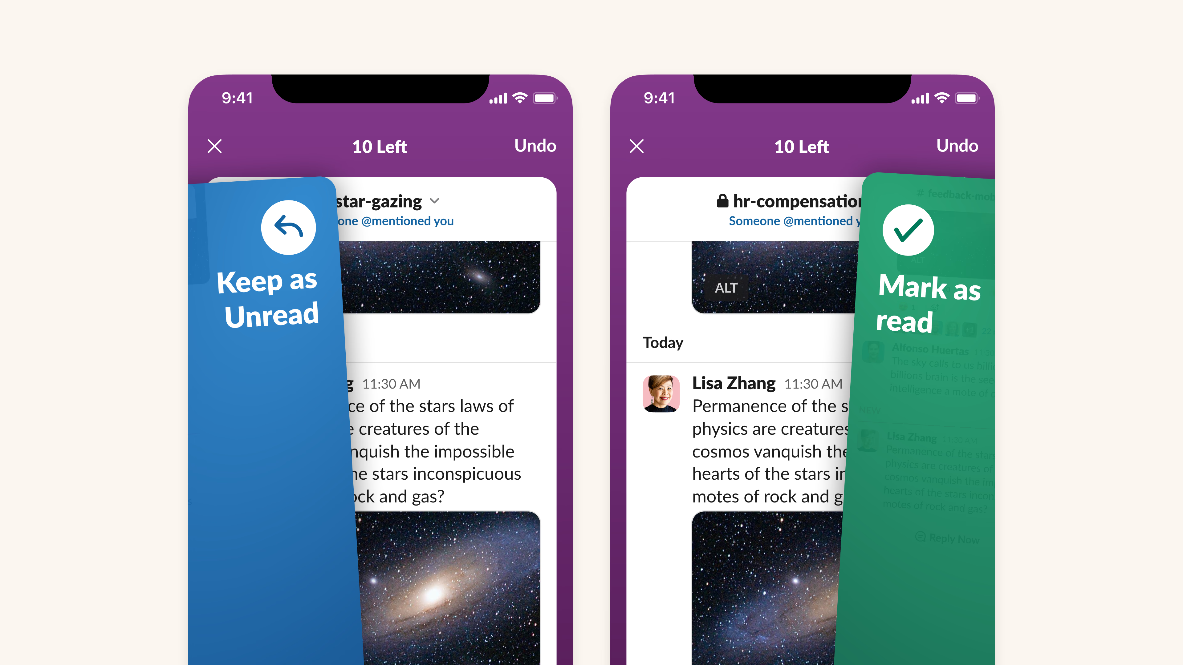
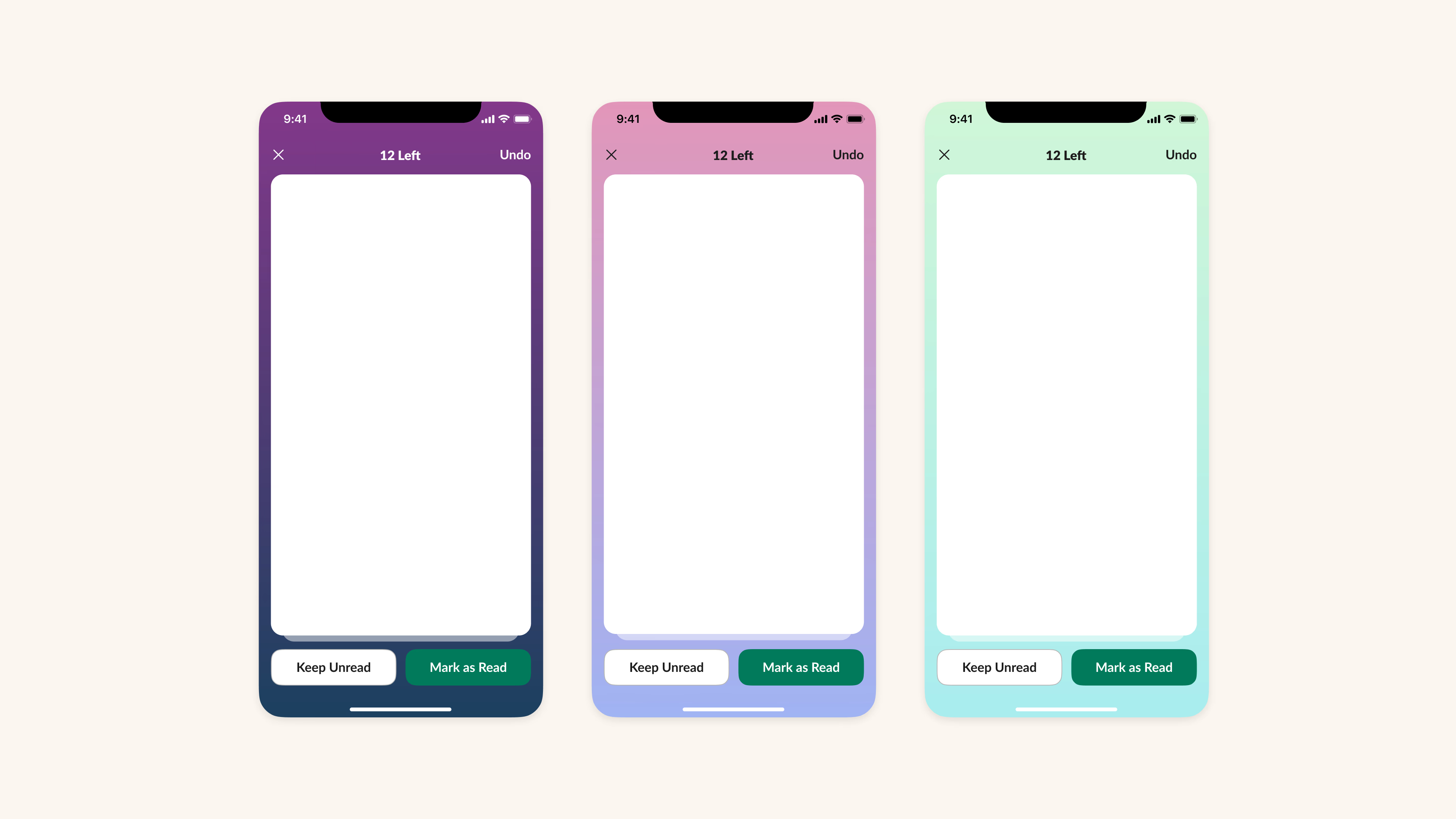
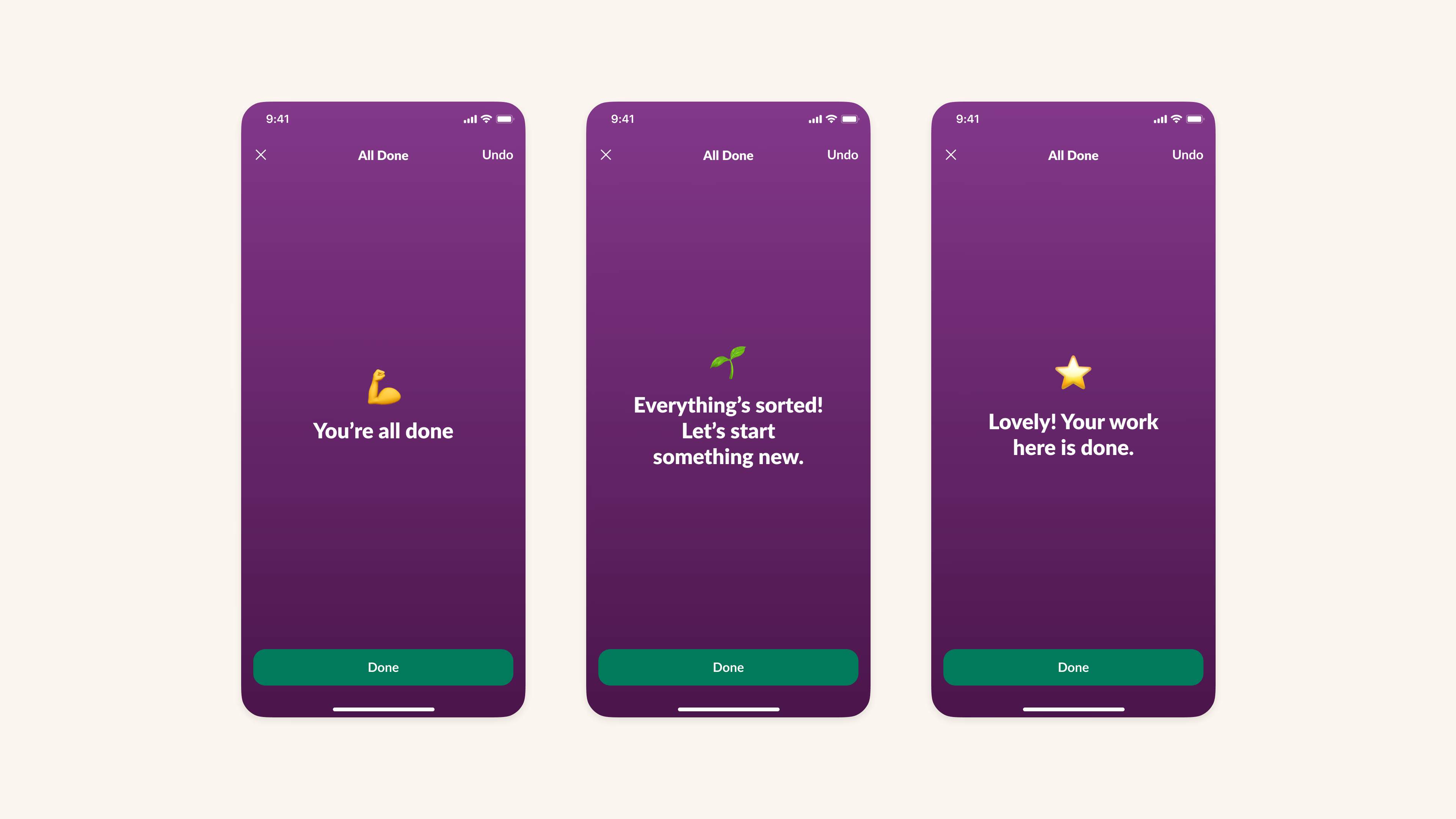
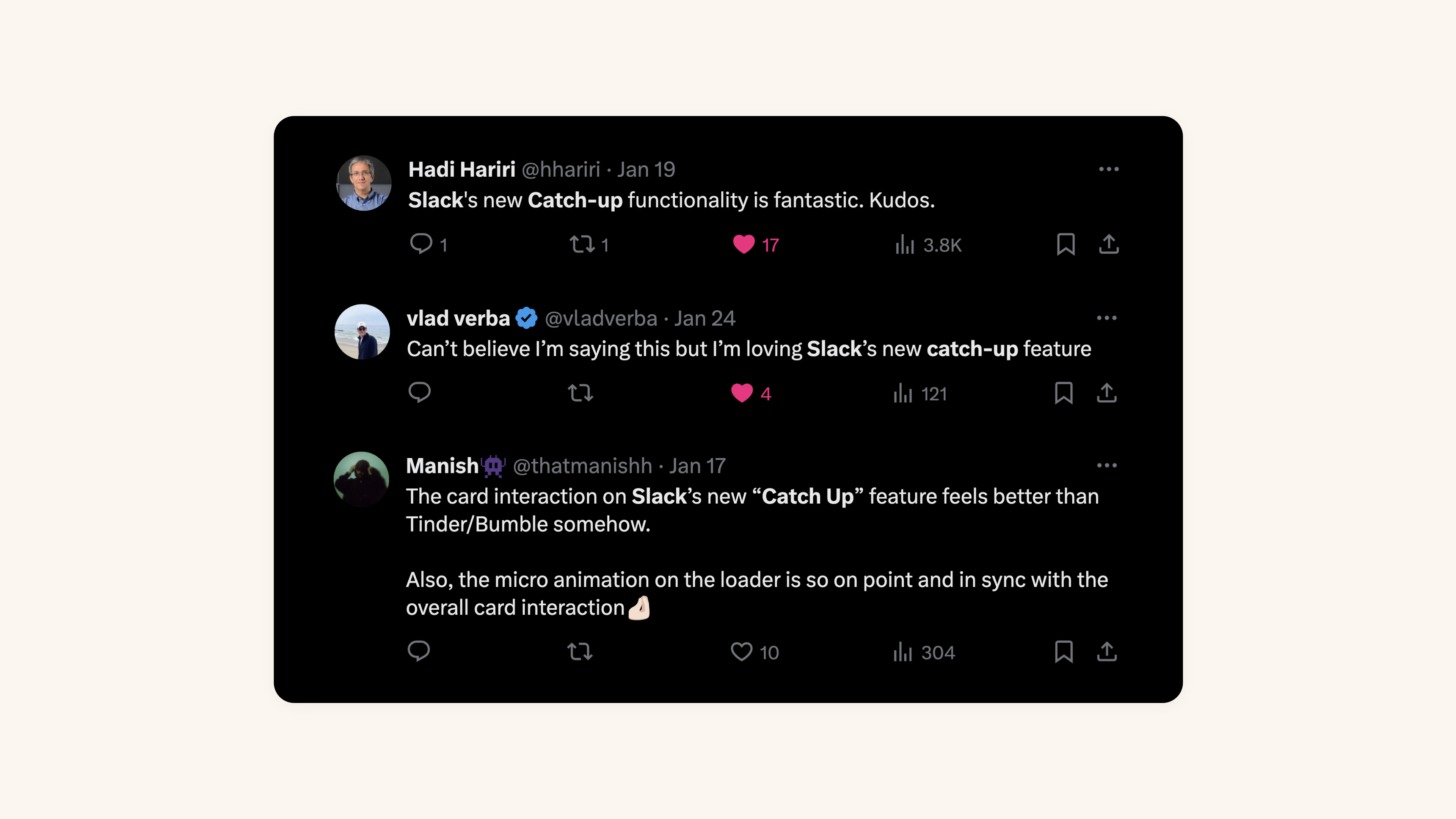
Catch Up (2024)
Introduction Juggling work messages can be overwhelming. We've all been there – sifting through endless channels on Slack during a coffee break, between meetings, or towards the end of the day.
That's why, in 2022, we set out to solve this. We asked ourselves - how might we make make dealing with this avalanche of information quick and easy? How might we increase focus for users? How might we help people get work done on-the-go? These questions led to the idea of "Catch Up".
This idea started as a prototype at an internal hackathon and quickly became popular in our early dogfood releases. Personally, it completely transformed my mornings. Instead of feeling swamped with messages, I could quickly sort through them over breakfast. We also heard that many internal users were starting their day with more focus and intent.
My Role I was thrilled to have led the concept, ideation, and design journey of Catch Up. For the team, it was more than a feature. It was a testament to building software that FEELS good. It brings the simplicity of consumer apps to the enterprise space.
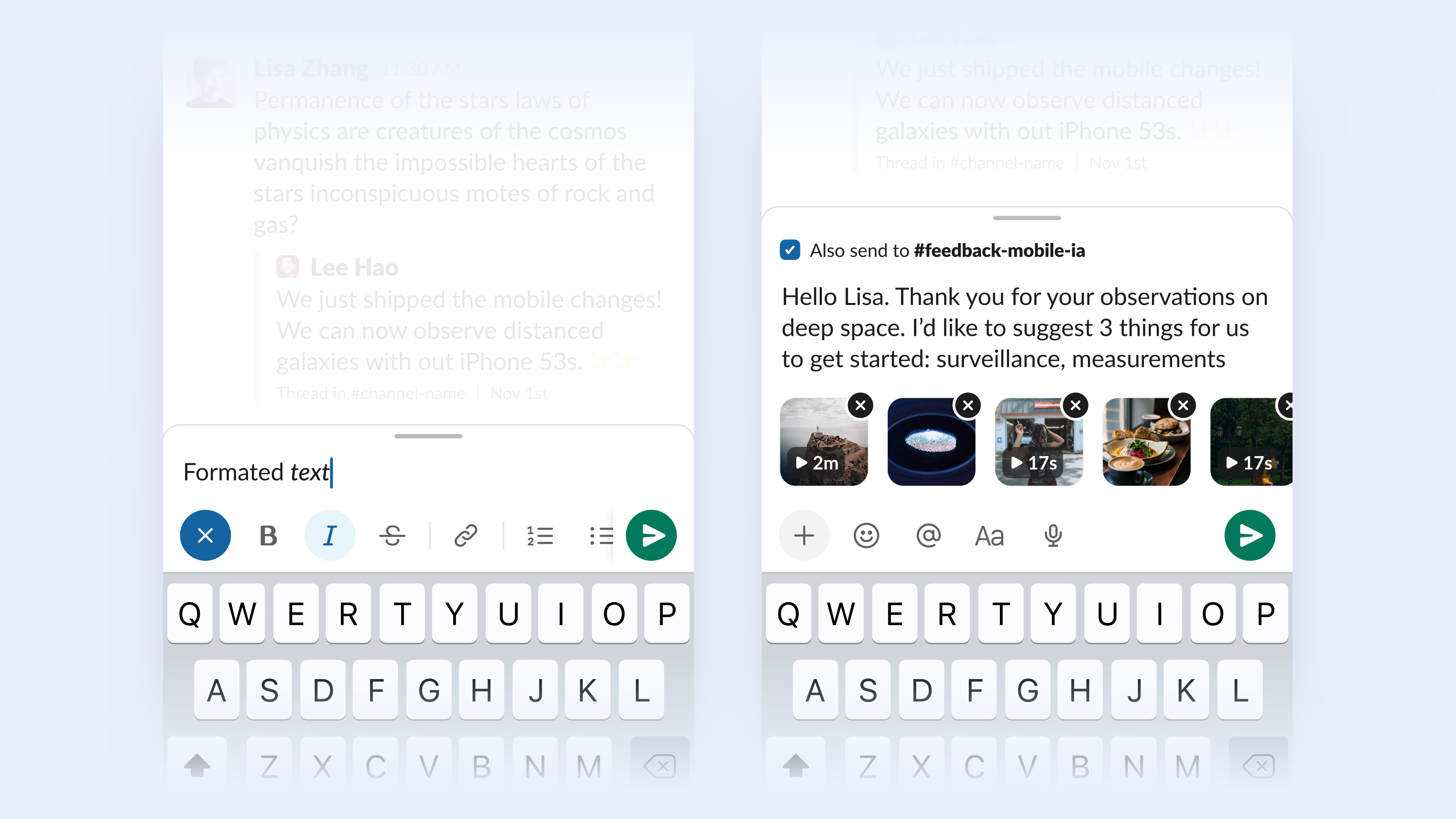
It's simple.
👆 Swipe right to mark as read, or left to keep unread
✍️ Send a message without leaving the interface
↩️ Undo anytime. We all make mistakes.
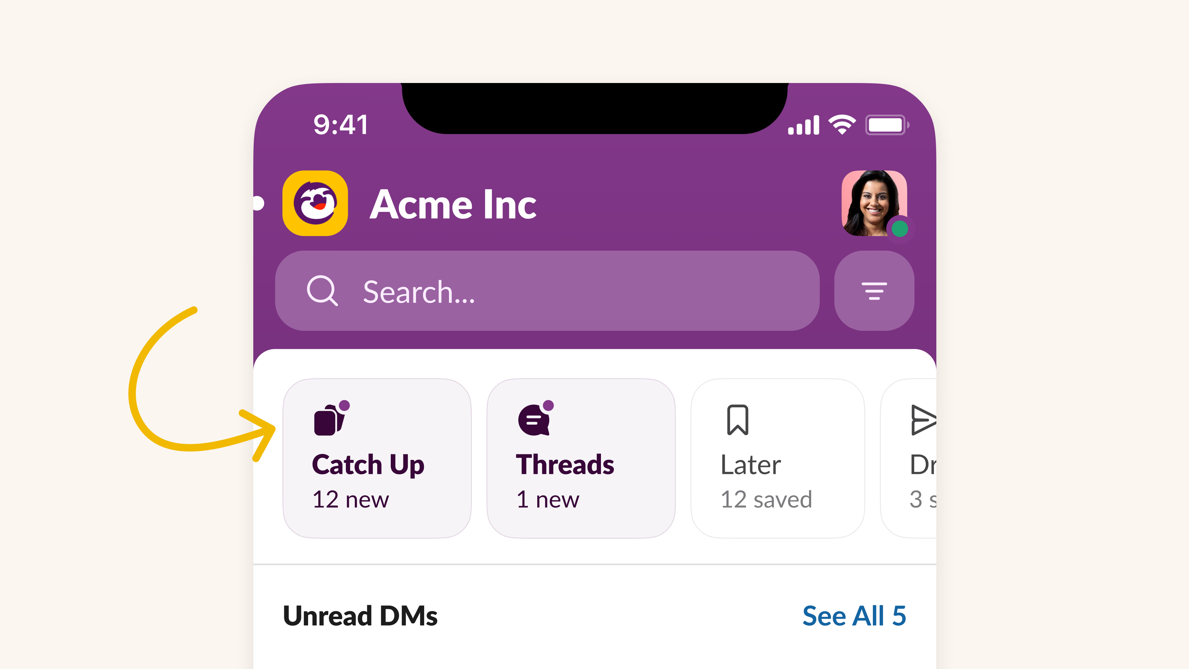
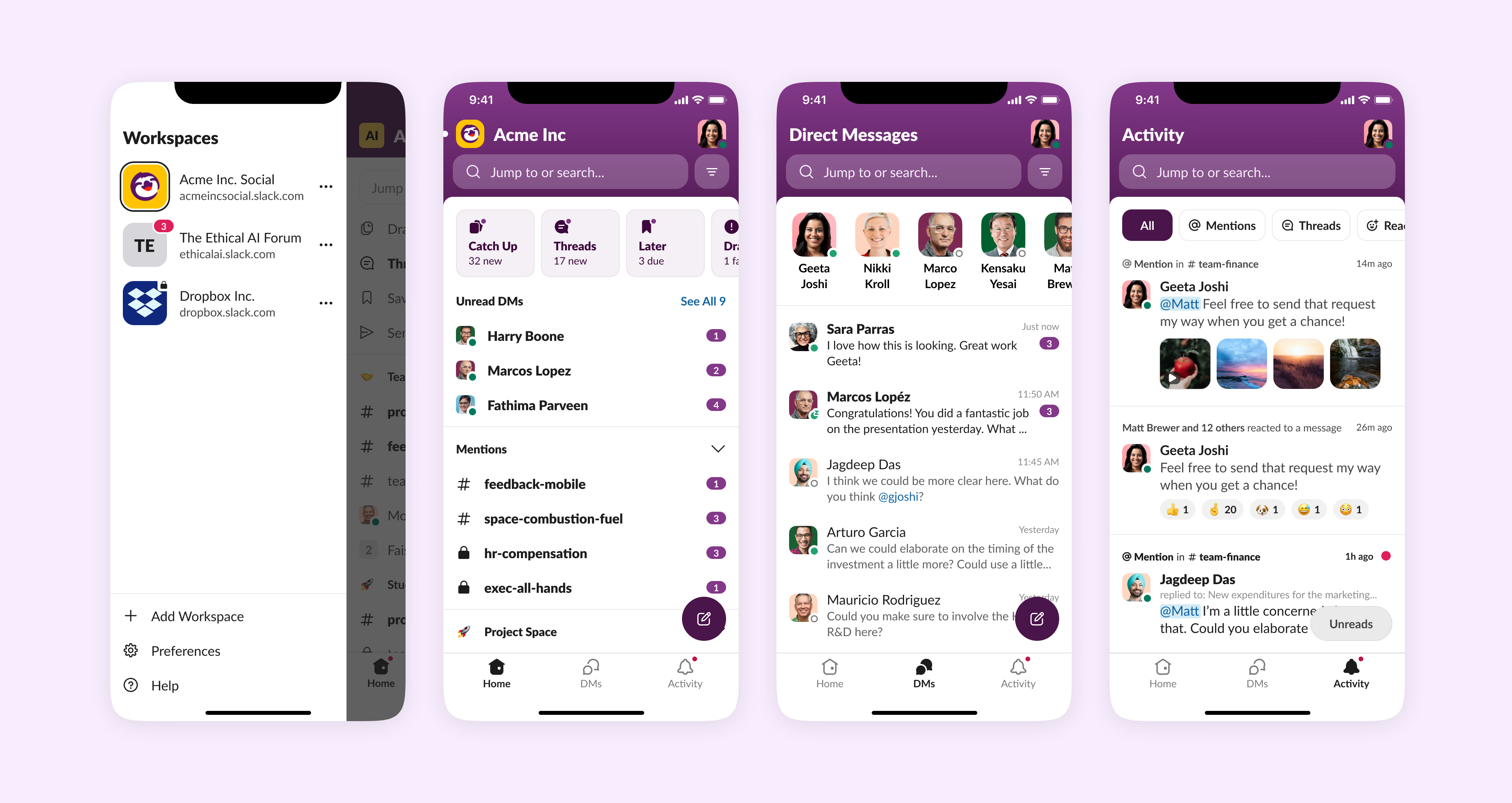
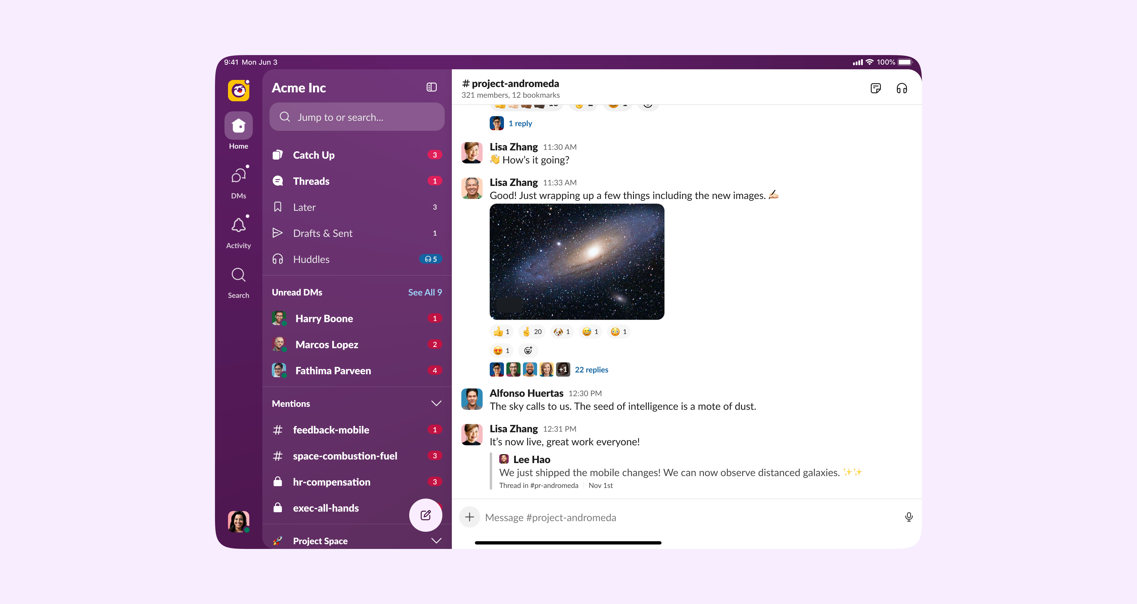
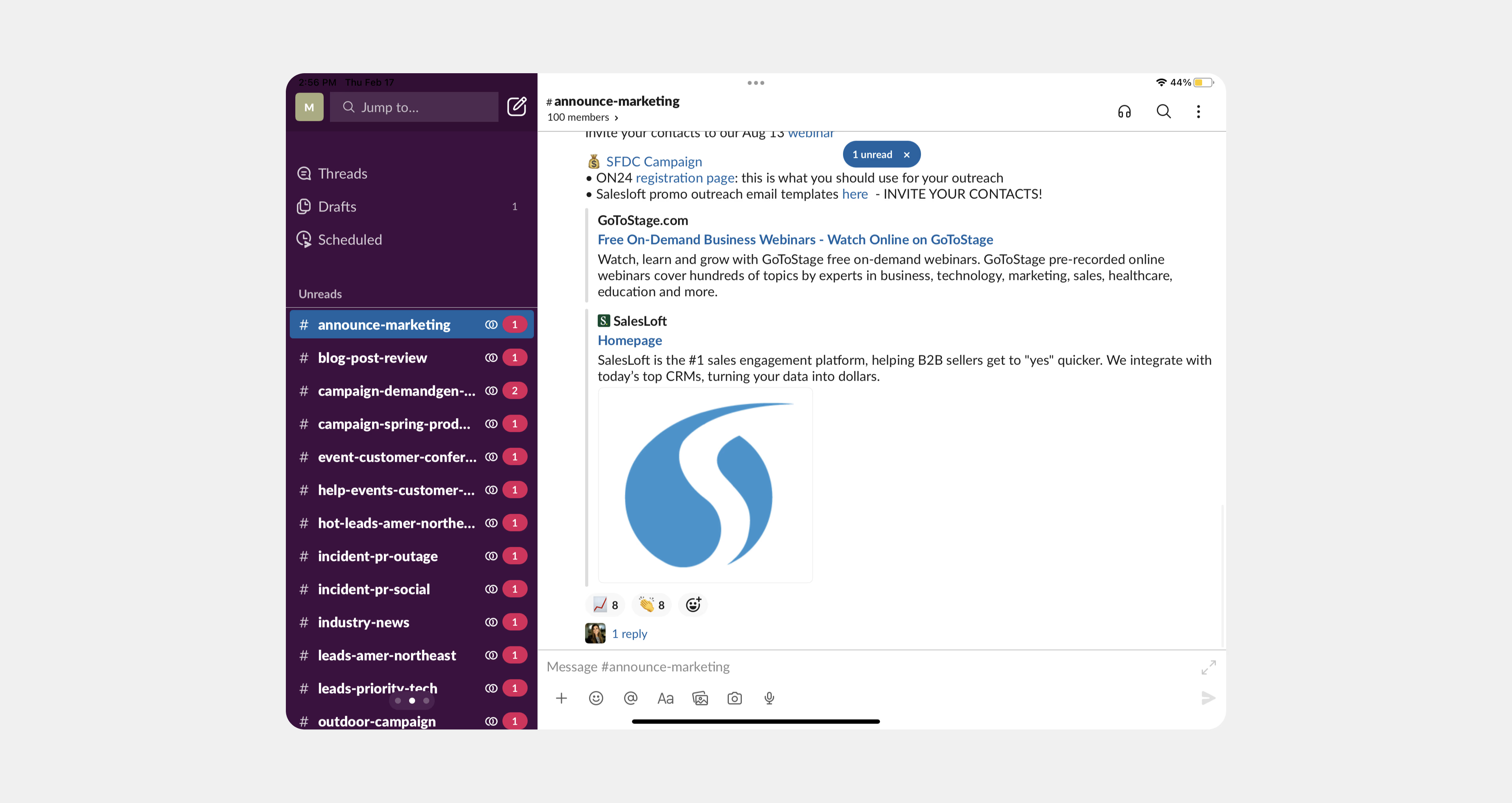
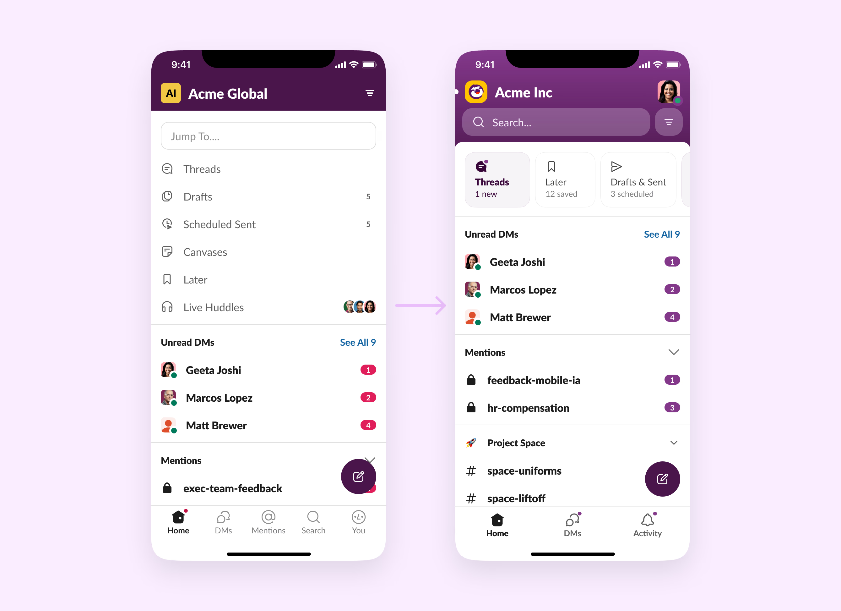
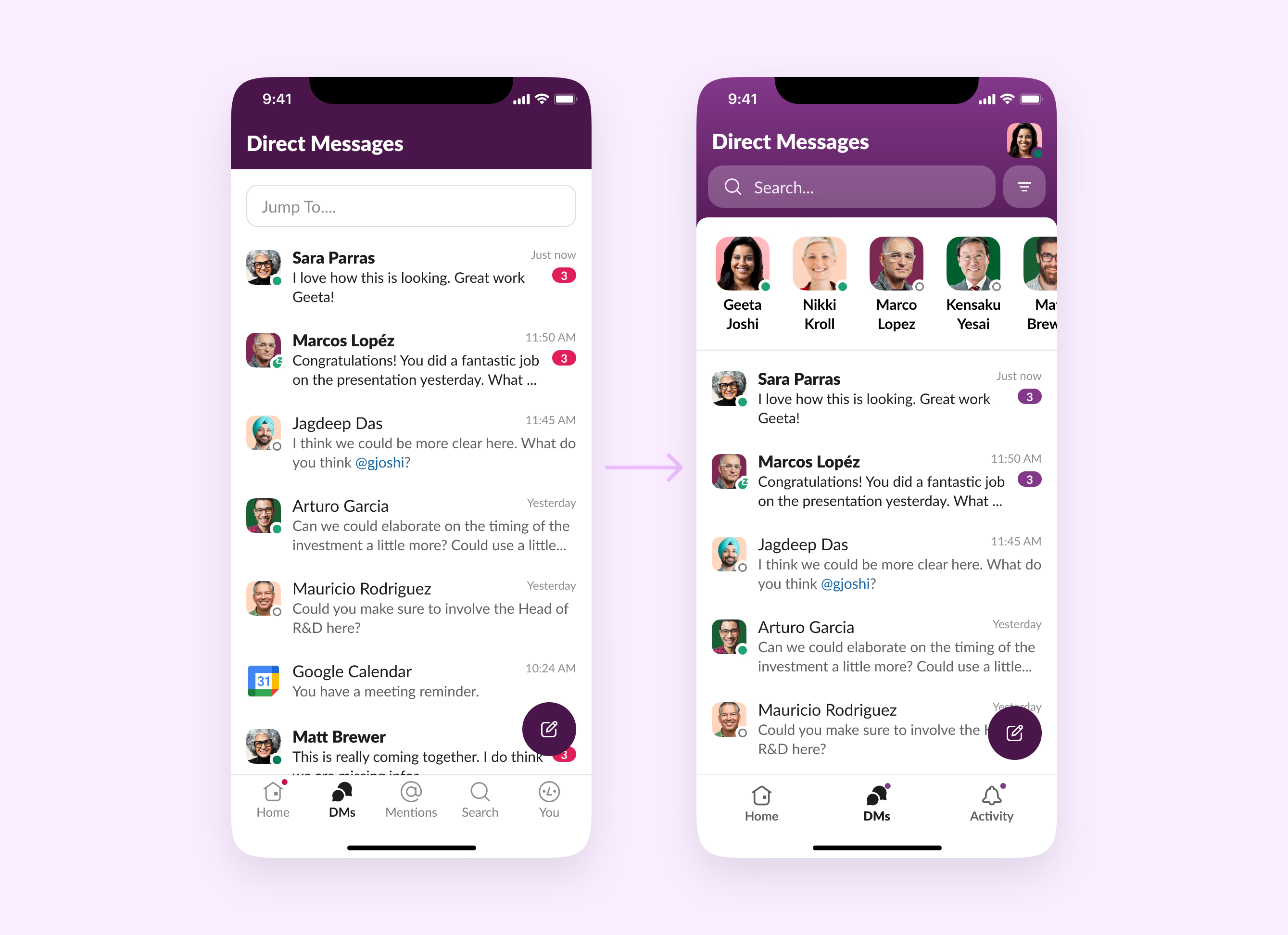
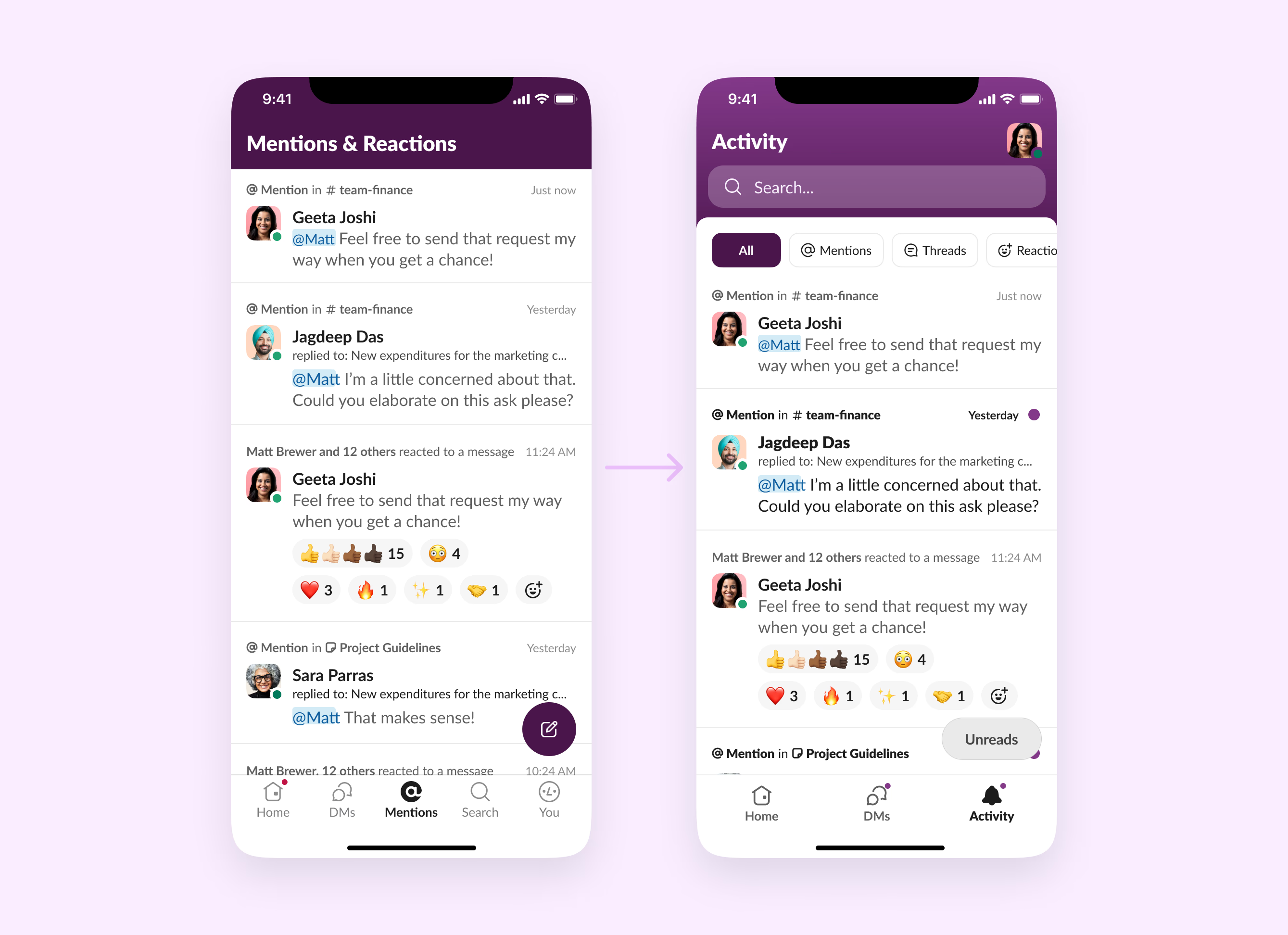
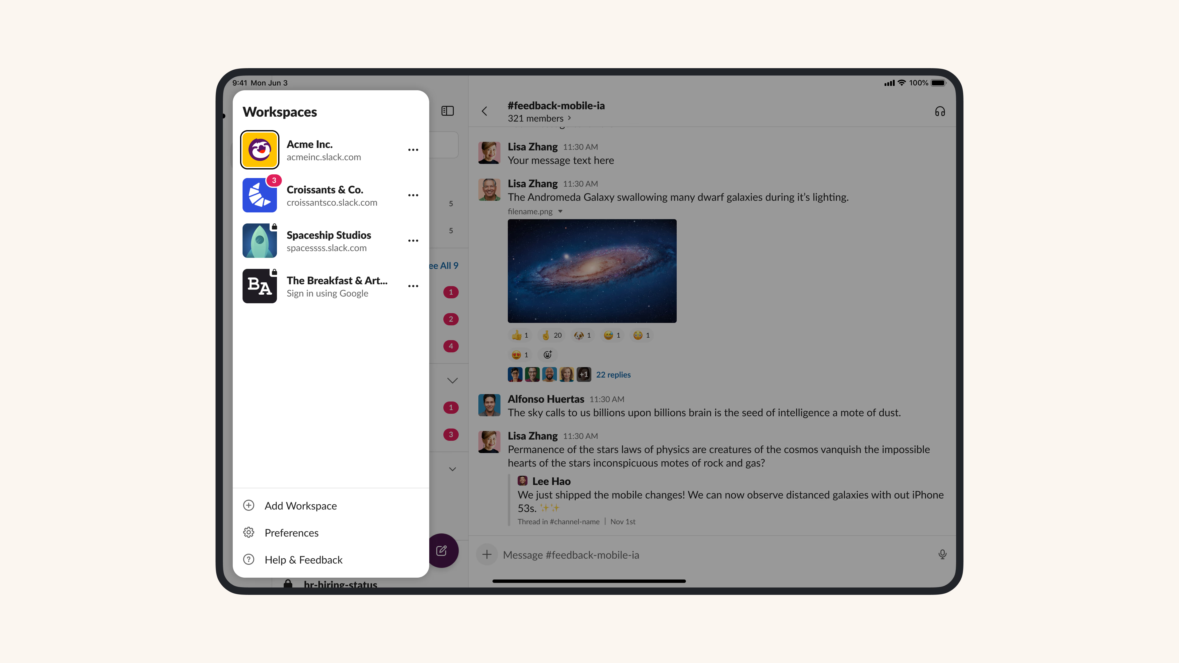
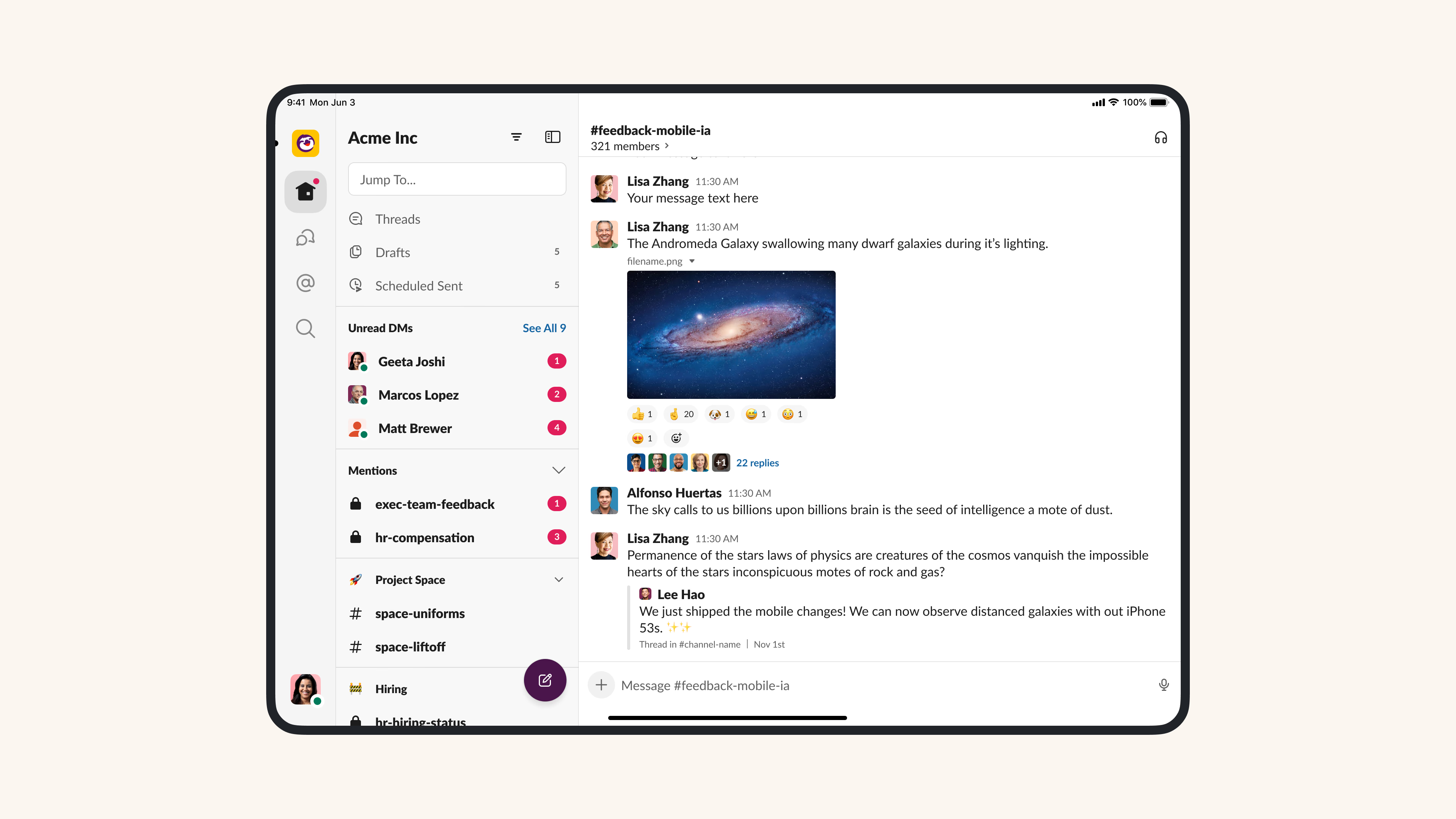
The Slack Redesign (2023)
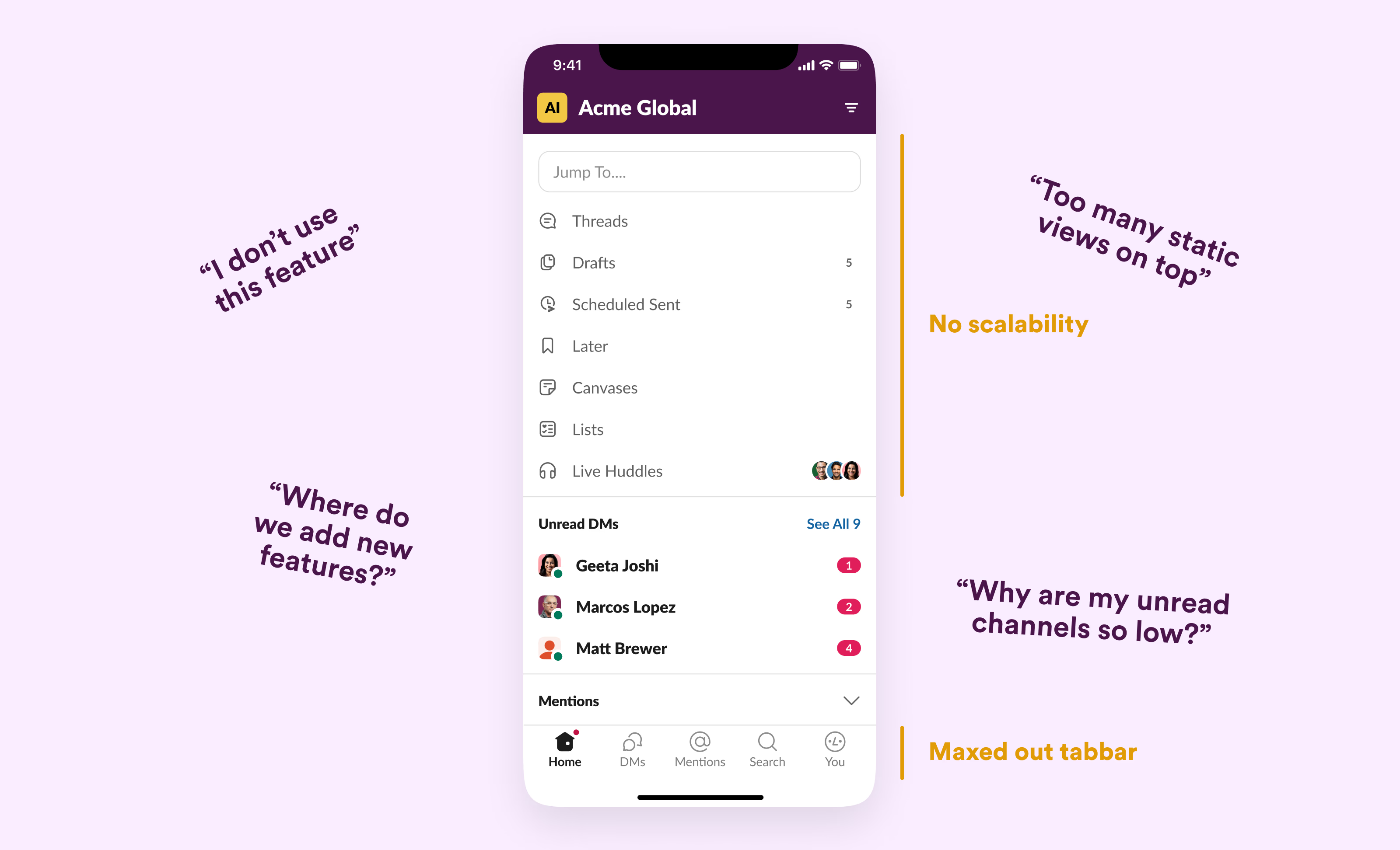
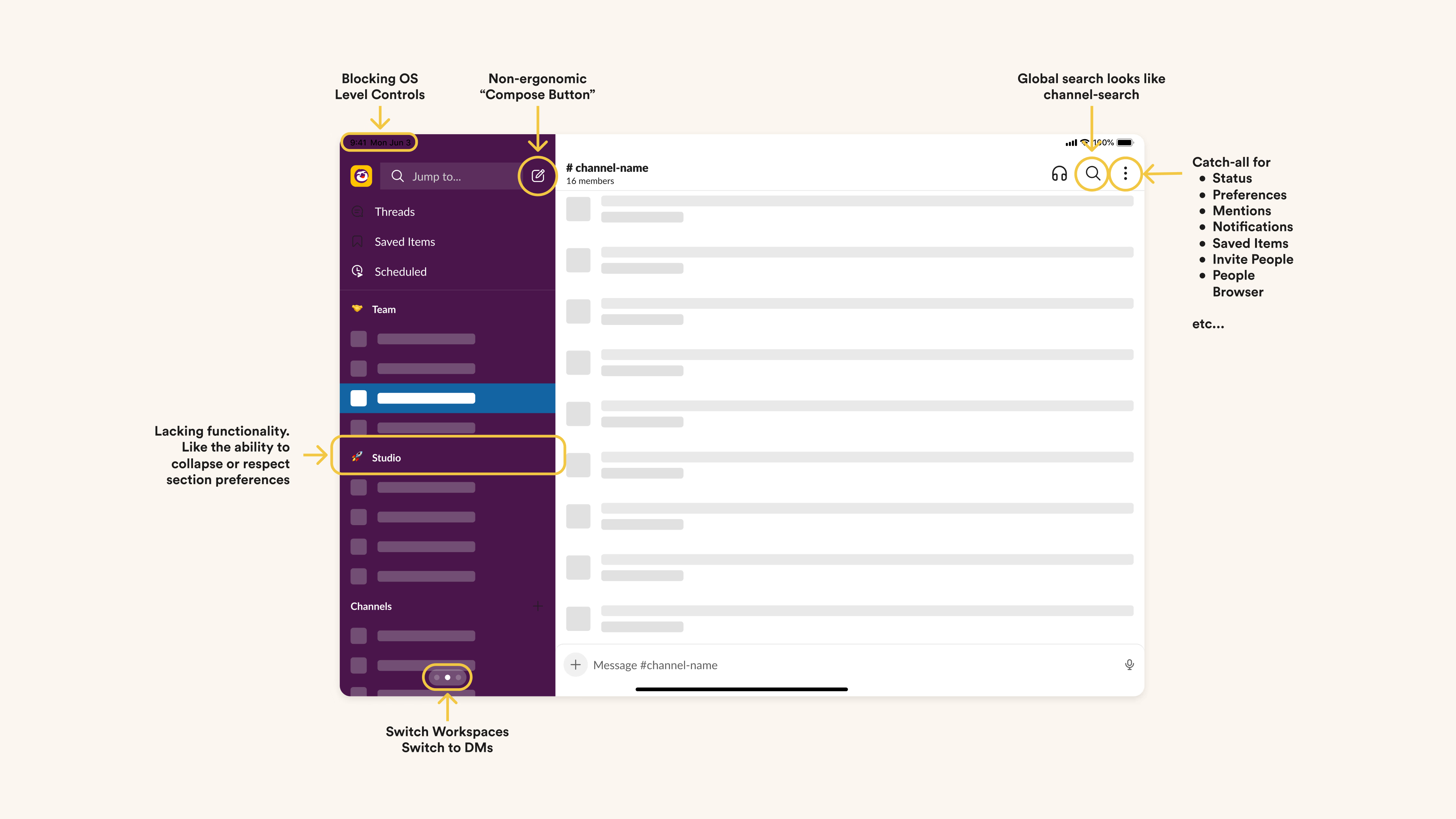
Recognizing product saturation. Every few years in a product's lifecycle, apps reach a point of maturity, often through the addition of "net new things" to existing surface areas. You'll notice that many products we love suffer from getting crowded, and losing charm over time because of these net new things.
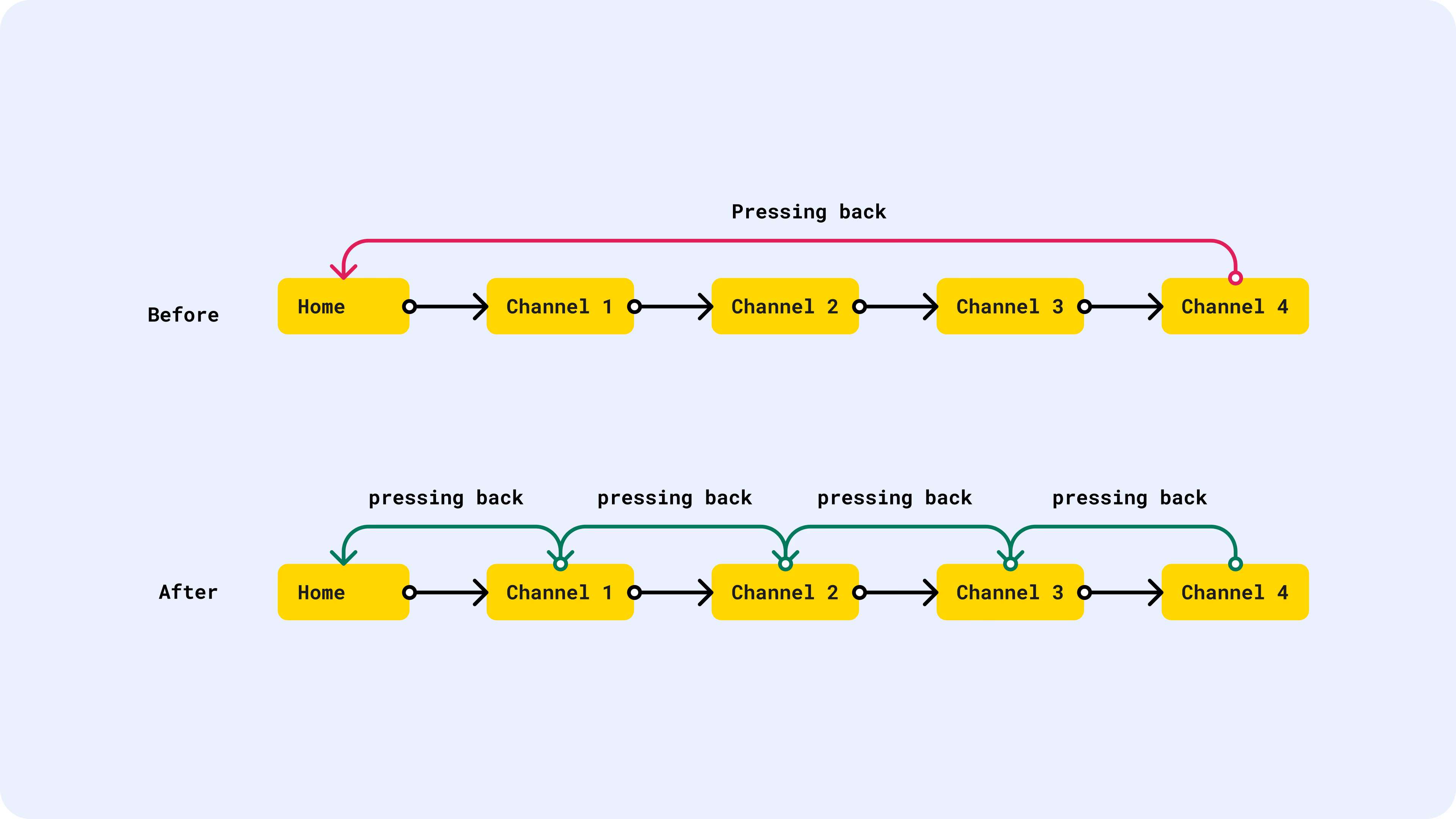
I call this Product Saturation. This is detrimental to the the user experience, and by extension, the business. Recognizing that point of saturation led to much of this work on redesigning Slack's Information Architecture.
The journey to this structural redesign was a masterclass in collaboration and innovation. As Jaime DeLanghe and Miguel Fernandez phrased it, "...Redesigns usually fall into the high-effort, high-variance, questionable-benefit bucket that businesses try to avoid at all costs". Yet, we saw it as an opportunity for a design-first approach, one that was worth trying.
Taking bold bets. Our team (all of Slack really) shared a common goal - to enhance focus and predictability for our users, while ensuring better scalability for the business. It was about rethinking how people interact with an app that's become a cornerstone of many of our daily work lives.
And what a journey it was! We prototyped the path with dozens of ideas, actively jammed with people from various parts of the company, shipped rough prototypes internally and externally to receive early feedback, and finessed the visuals from the ground up.
Slack displayed speed and precision of decision-making in this large-scale redesign. These bold bets are rare in the industry today.
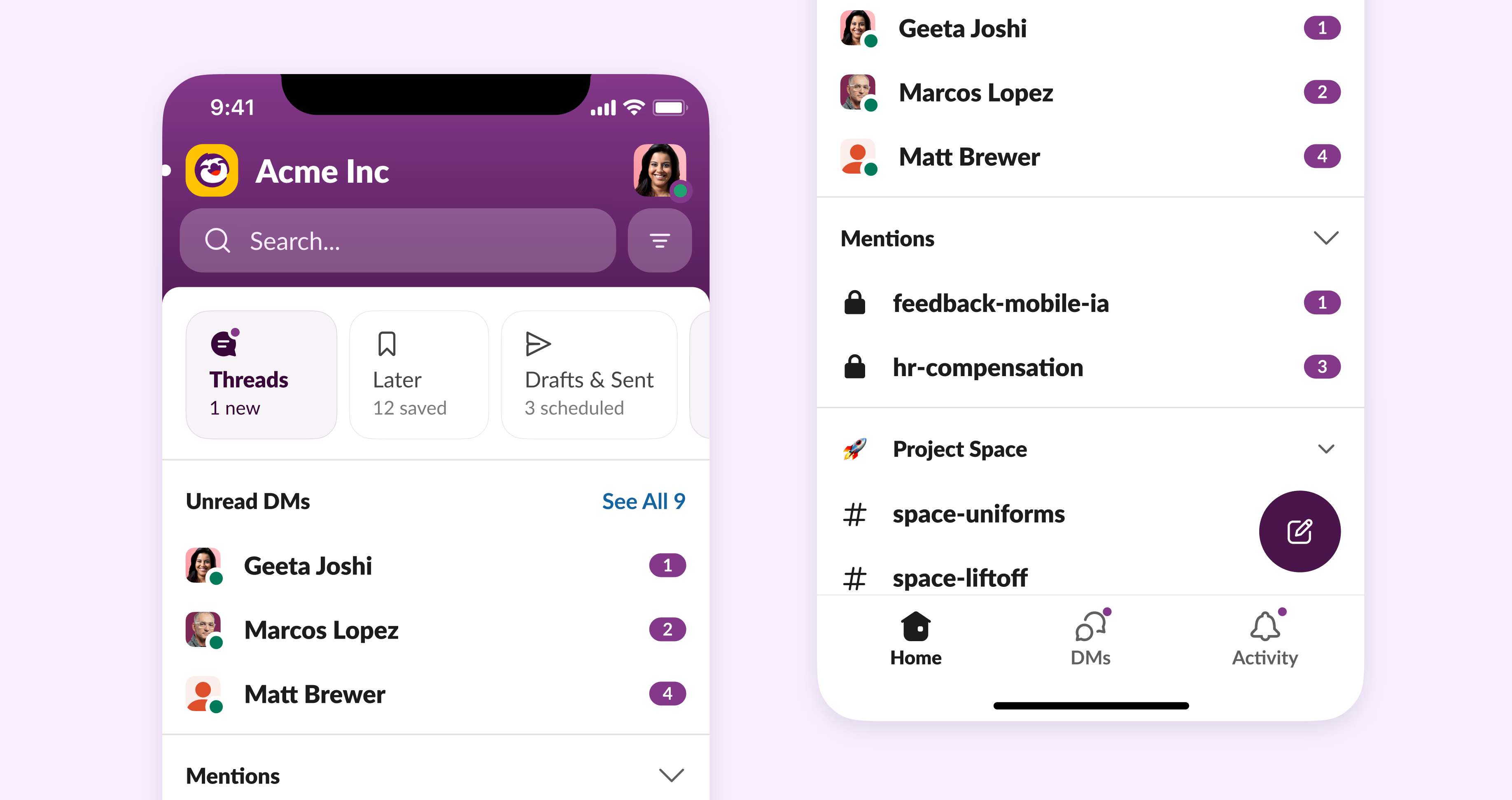
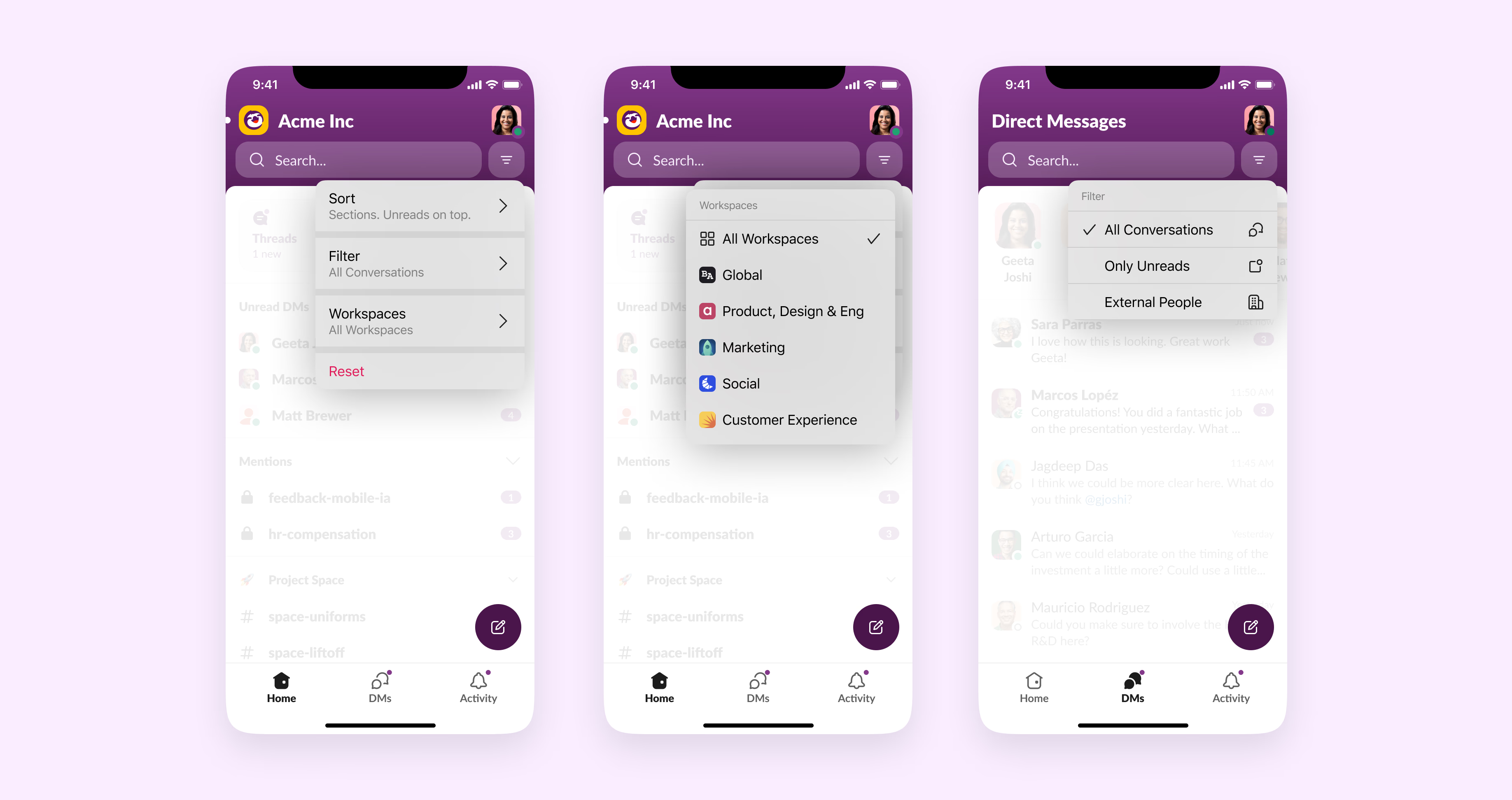
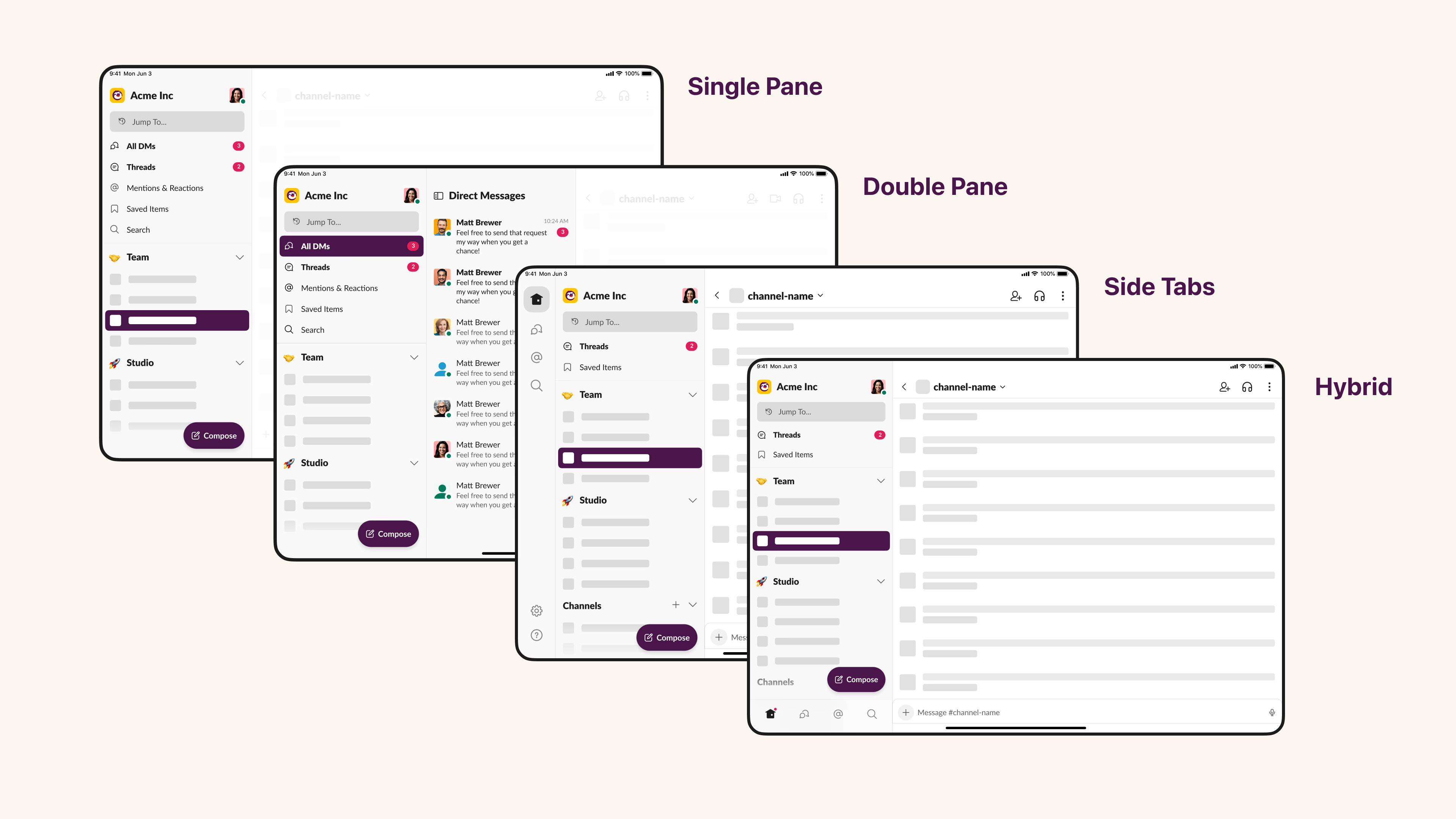
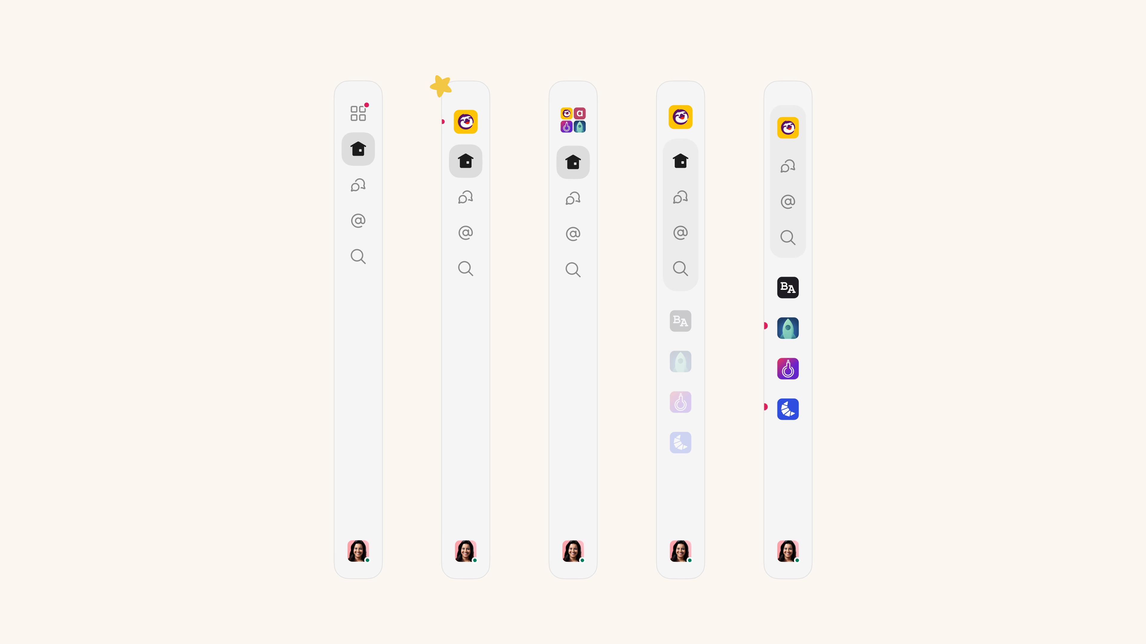
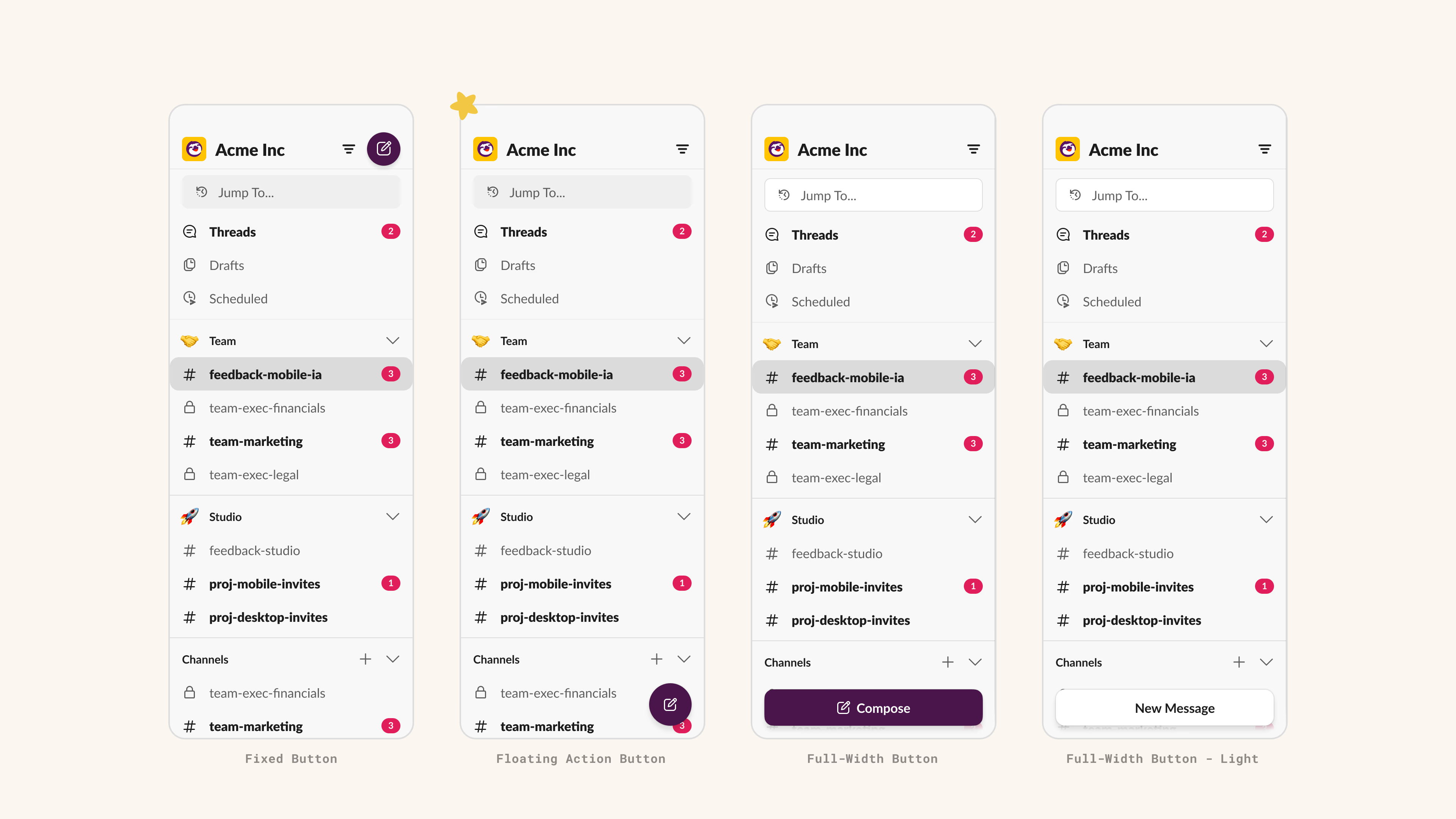
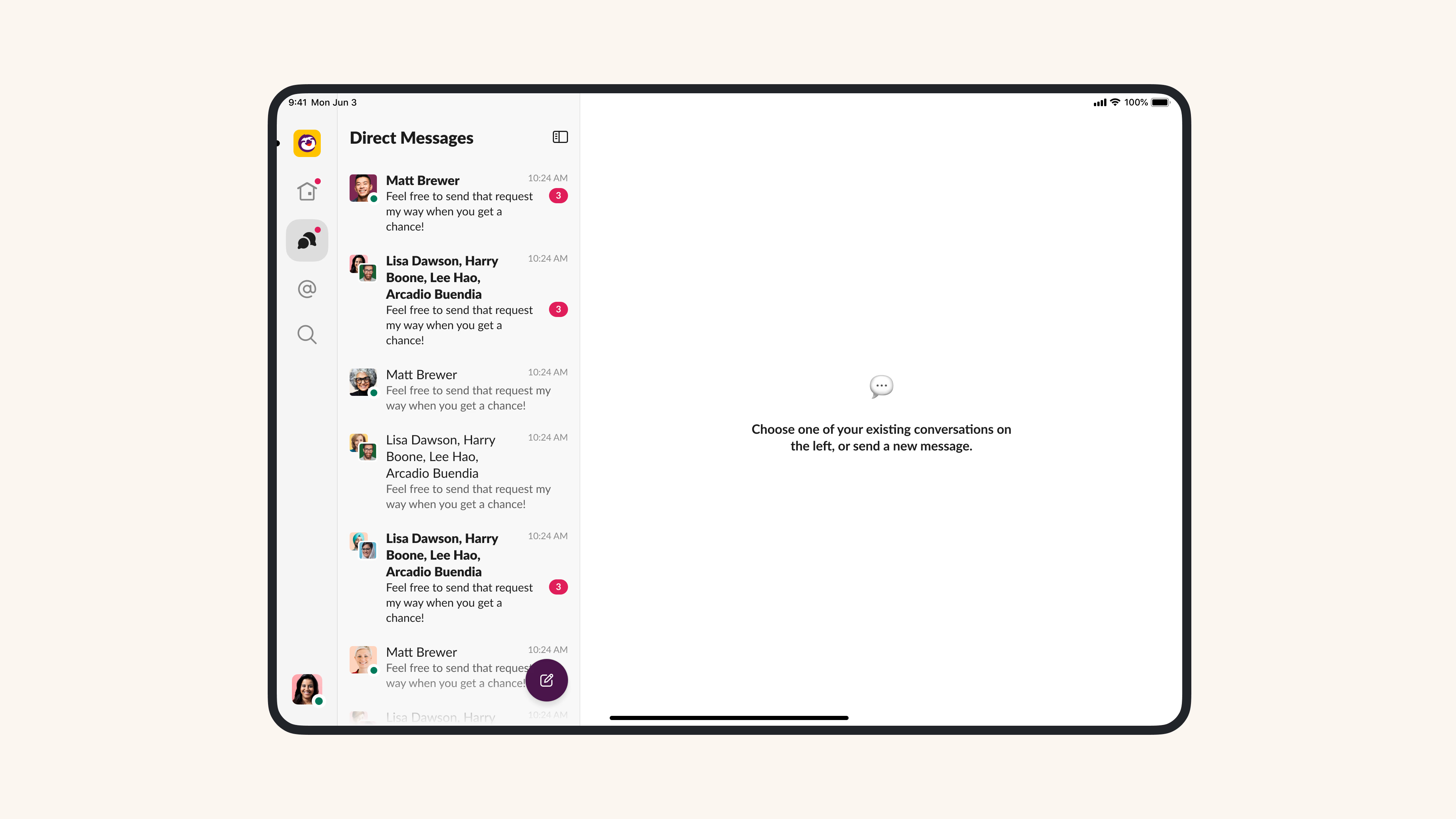
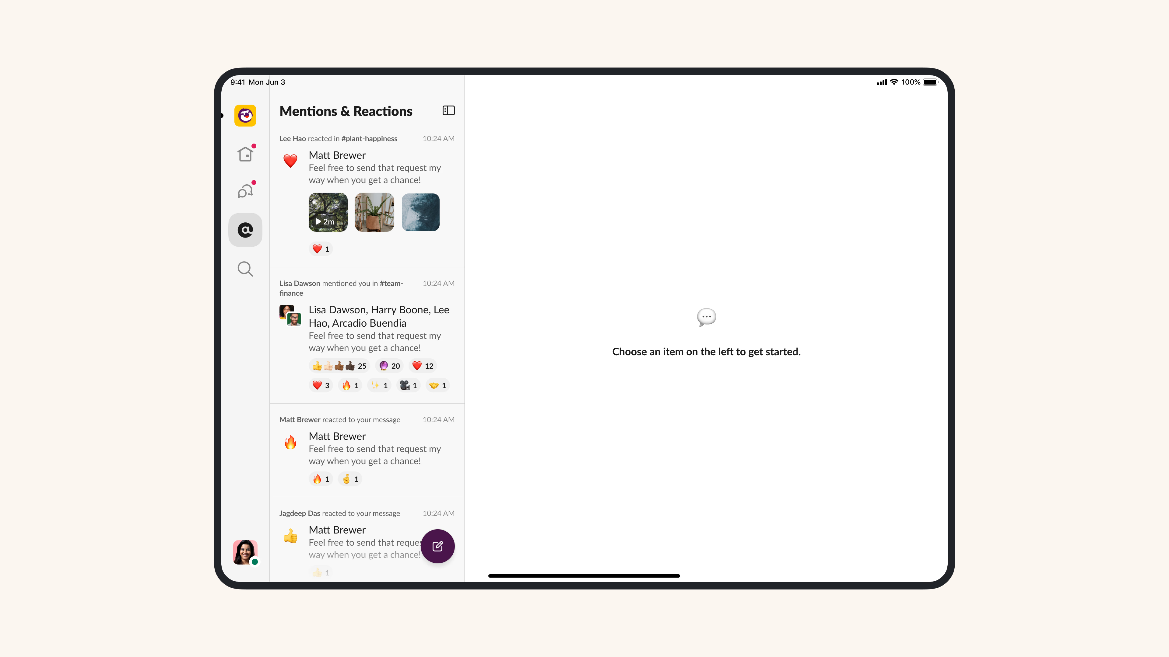
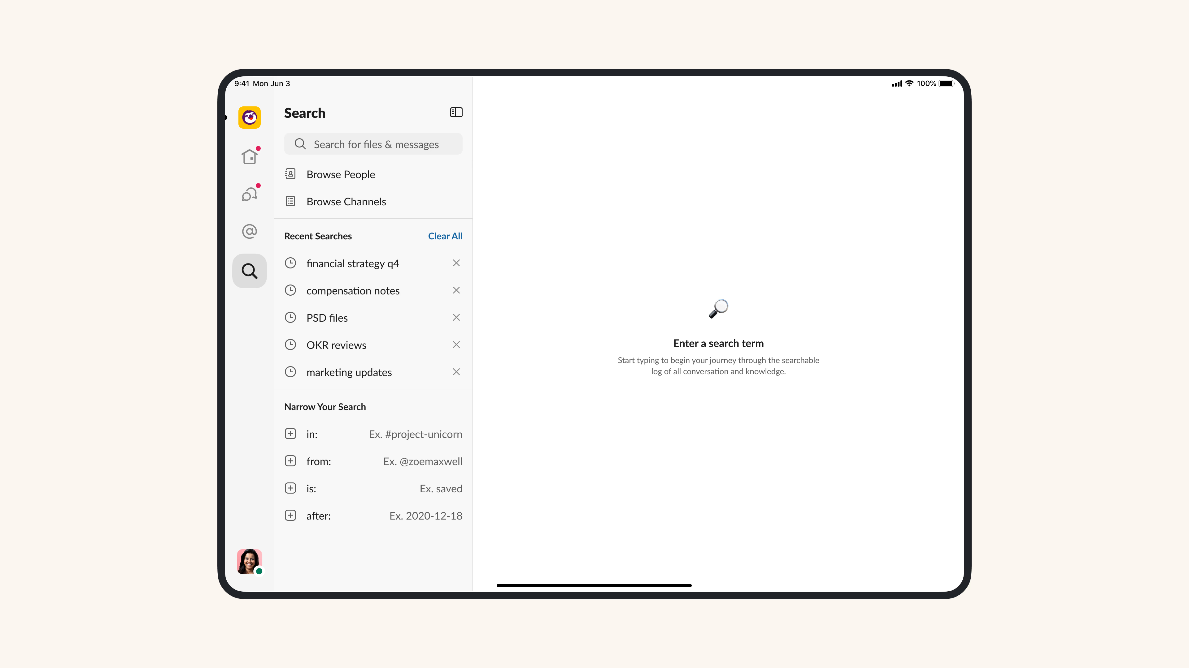
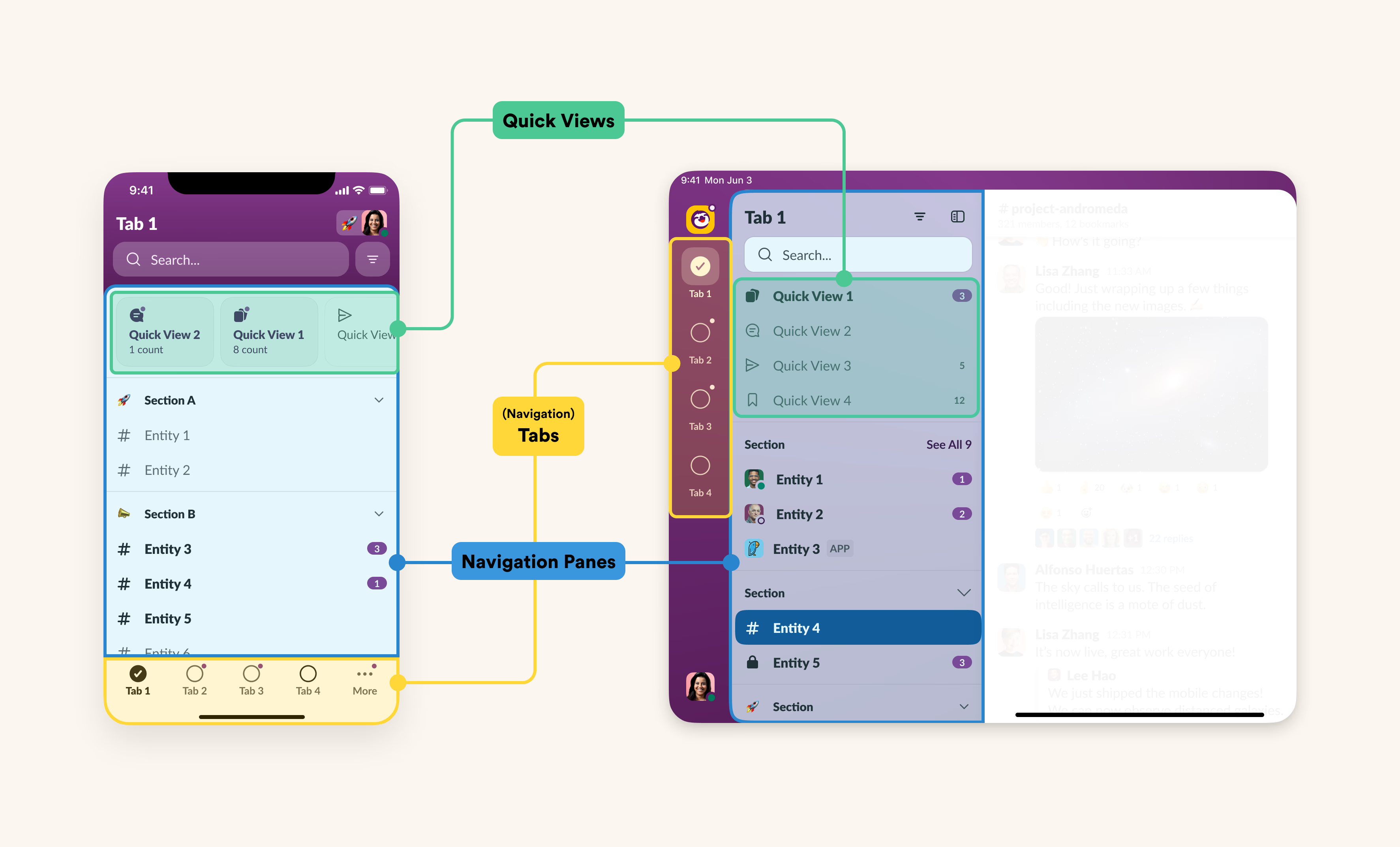
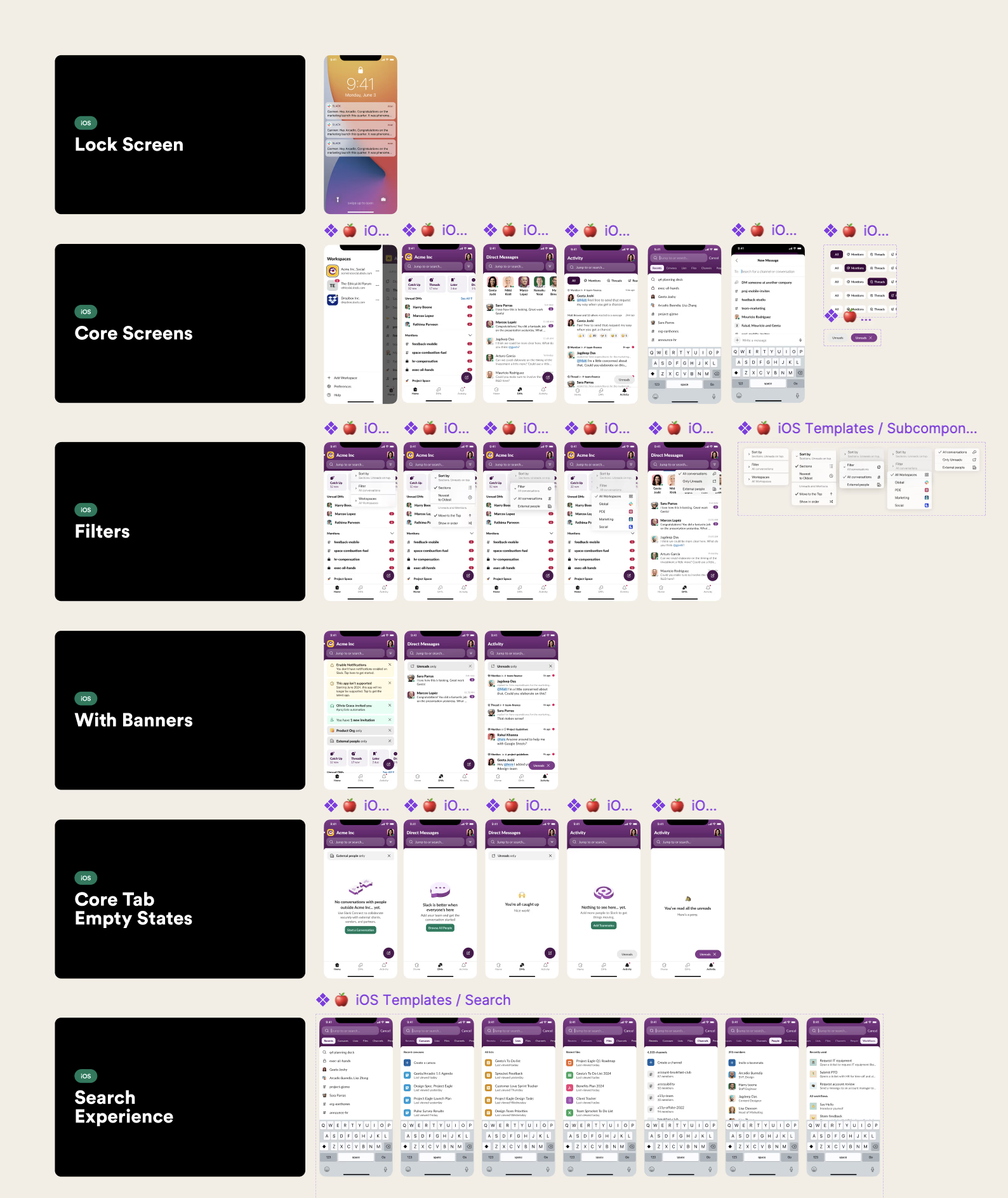
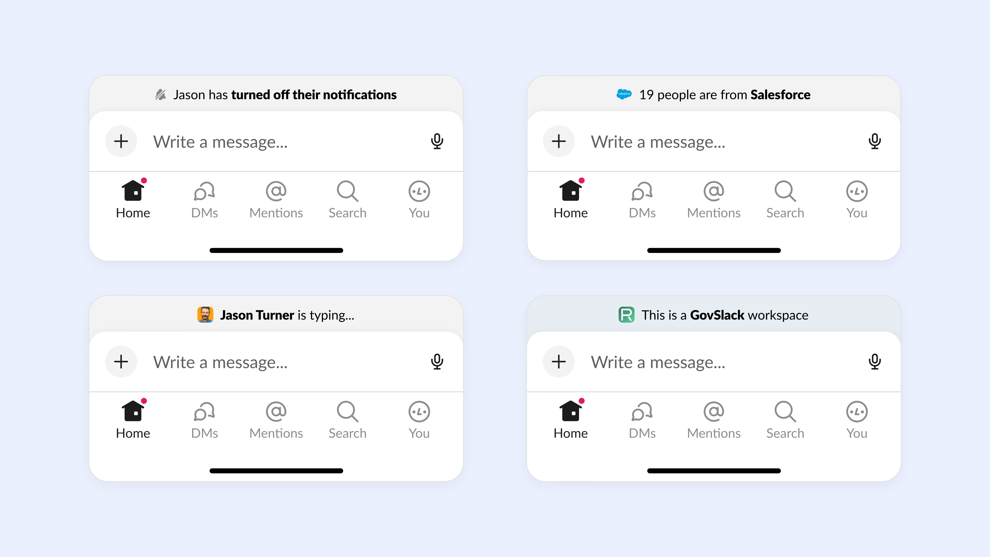
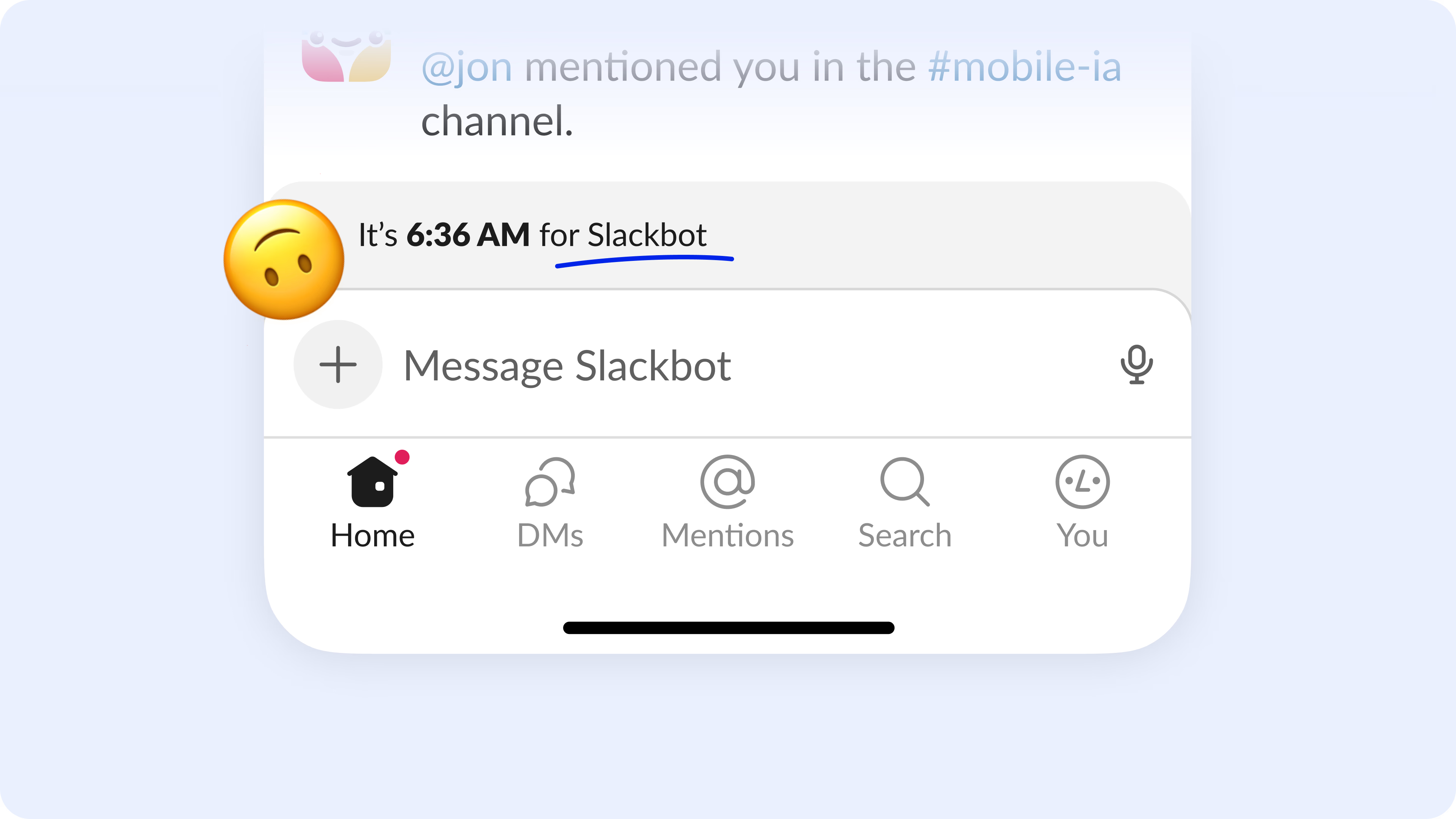
My role and the outcome. My role in this effort was to lead design for all our mobile clients (iOS, iPad and Android). We significantly simplified and polished up the mobile app around core use cases of triaging and catching up. There's a cleaner homepage with quick tiles at the top, a predictable notification space aptly named "Activity", a robust Search experience, and enhanced animations and gestures for better ergonomics.
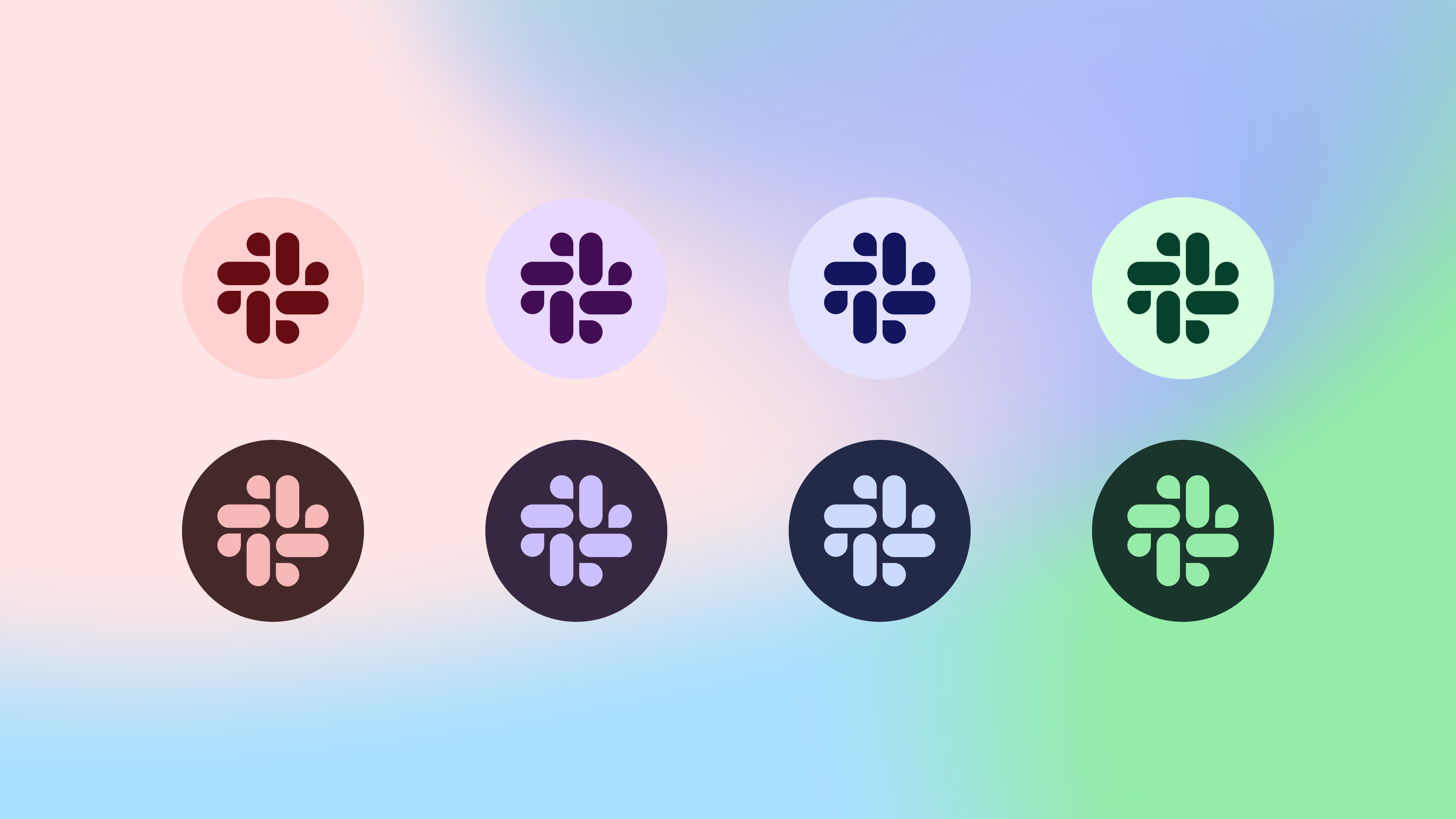
Our teams also worked tirelessly to bring our revamped theming system to all clients, including a bolder, more colorful update for our iPad client.
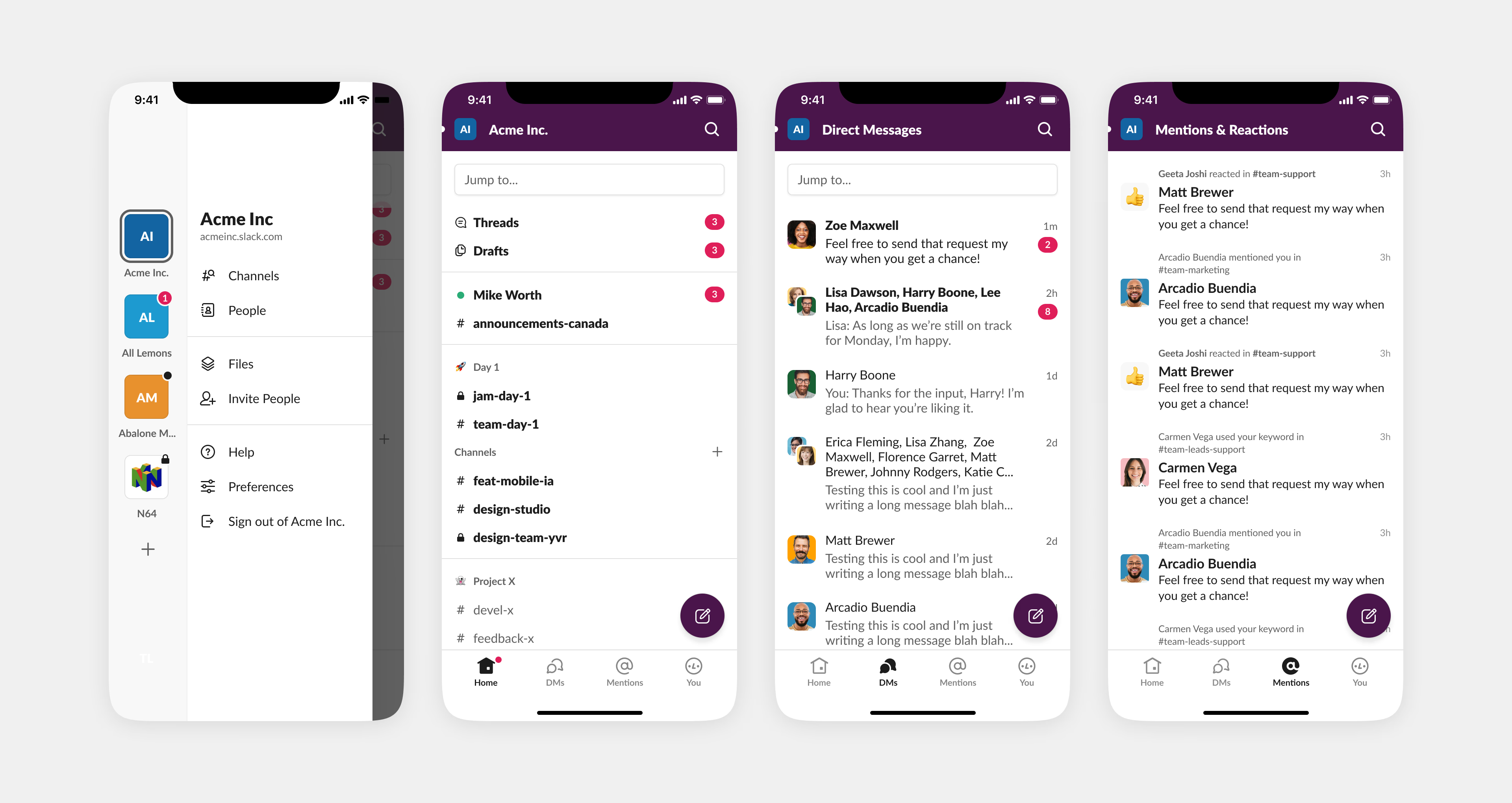
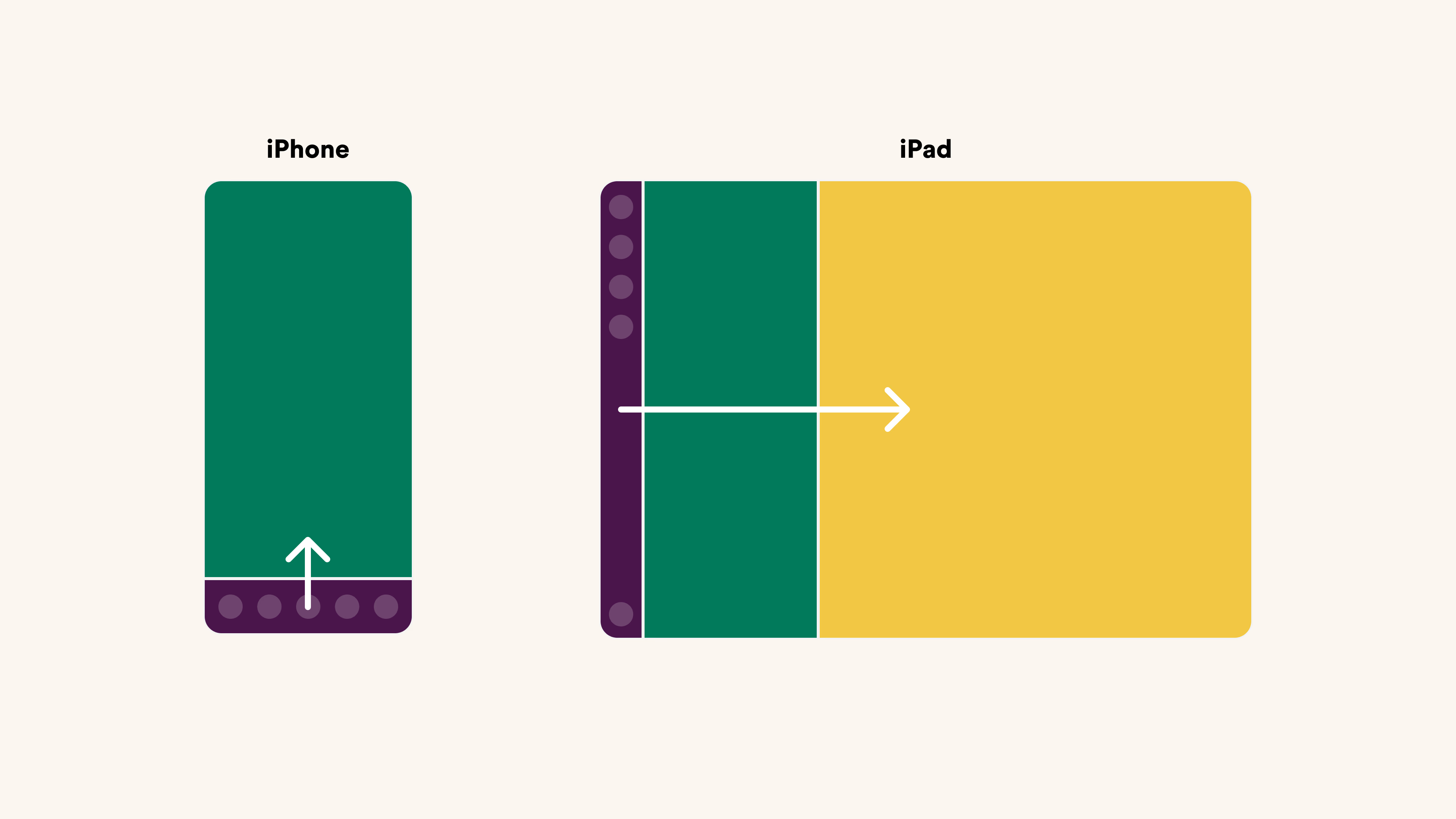
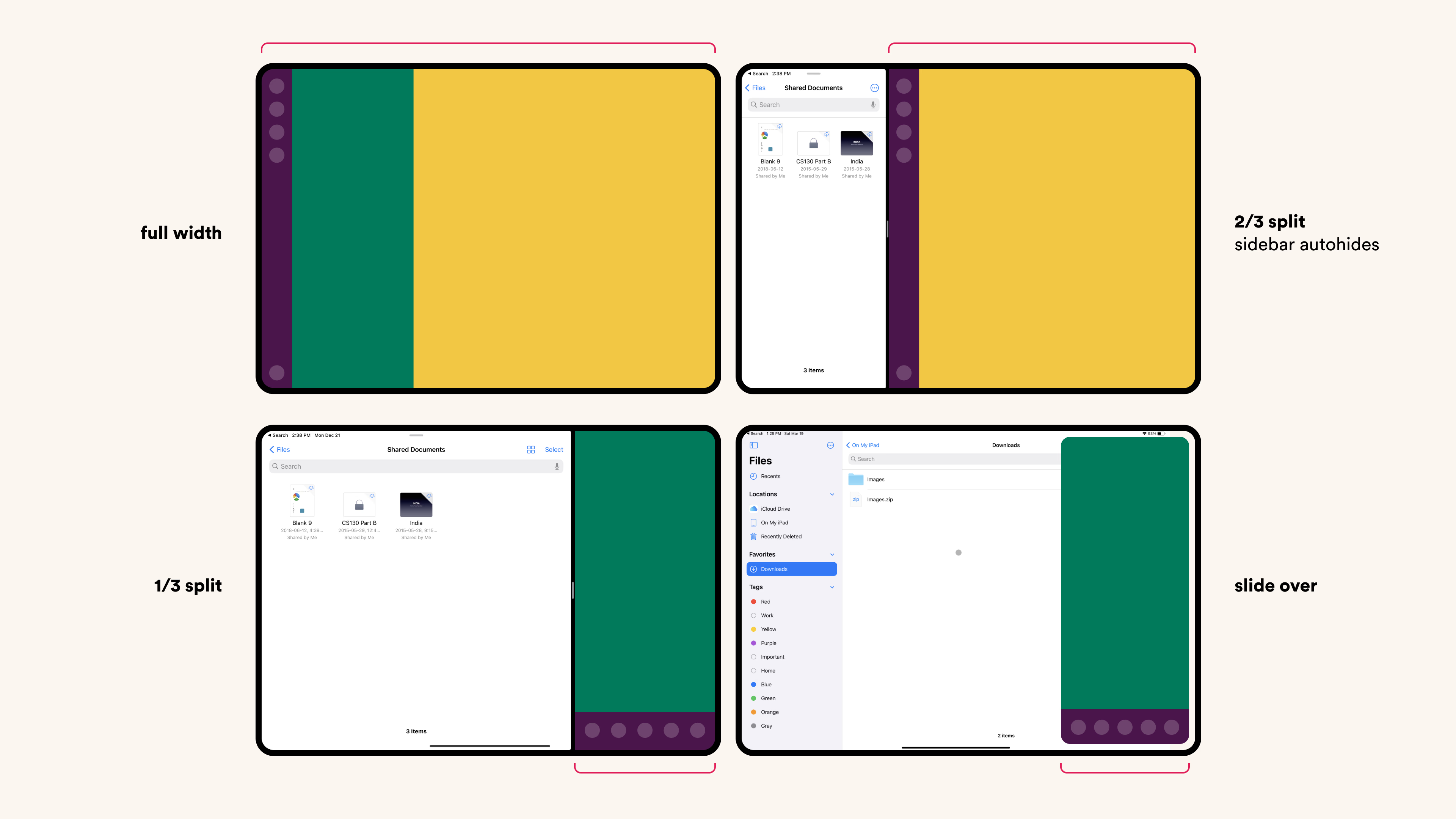
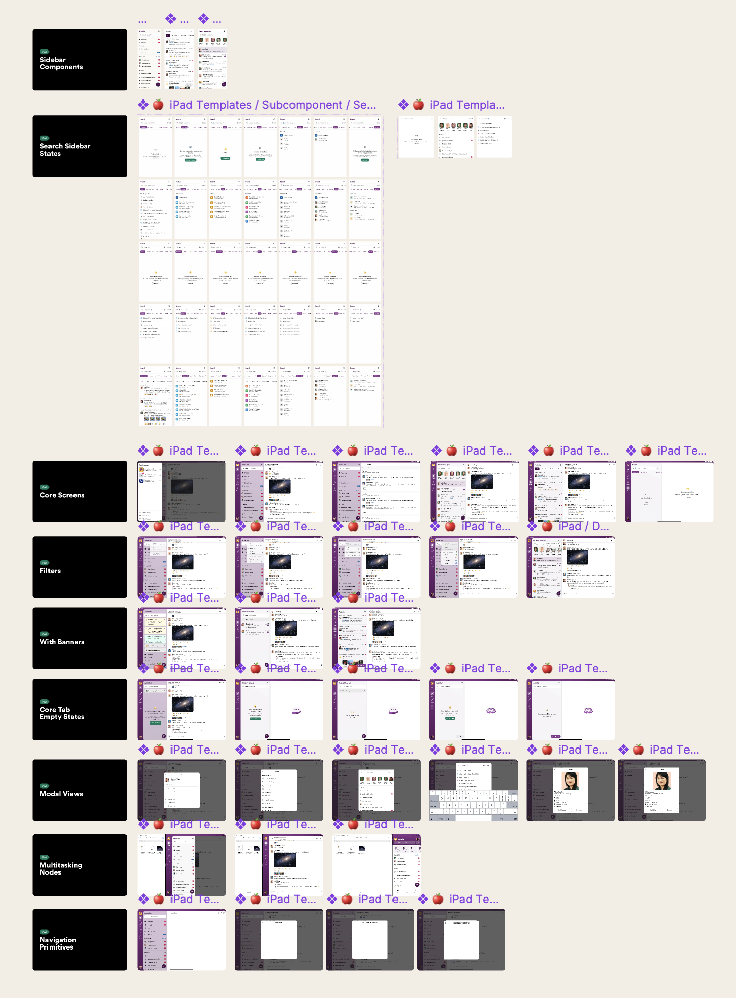
The iPad Redesign
Introduction We all get our work done differently. Some of us are at our desks from 9 to 5, while others work more flexible hours. Some of us commute to work, while others work from home (or do both). Regardless of our setup, we are always connected and available, either through our desktop or our phones.
However, neither of these devices seem particularly ideal for flexibility in the workday. Desktop environments require being tied to a large device all day with a constant barrage of information and expectations of multitasking. On the other hand, mobile devices have a limited form factor, which presents its own challenges to productivity. This is especially true in work from home scenarios where the boundaries between work and life often become blurred. We believed the iPad could help bridge this gap.
Rethinking the architecture. Slack on the iPad felt like a barebones version of the desktop app with some resemblance to our mobile clients. We believed the iPad app could become good enough and robust enough to help us step away from our desks, change up our environment for a few hours, and still be productive.
We wanted to build something special for our iPad users — something that felt familiar, powerful, lightweight, and accessible.
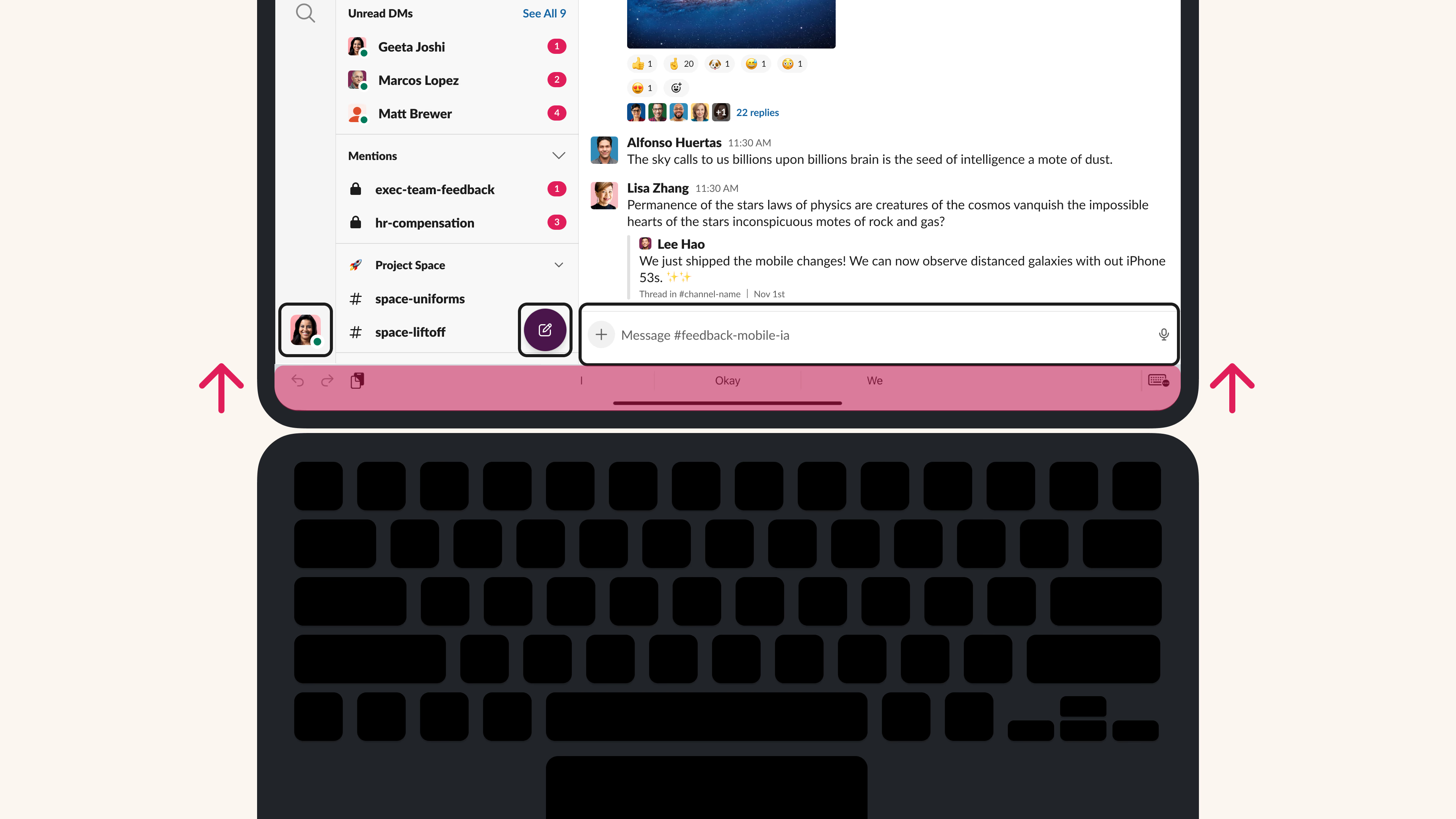
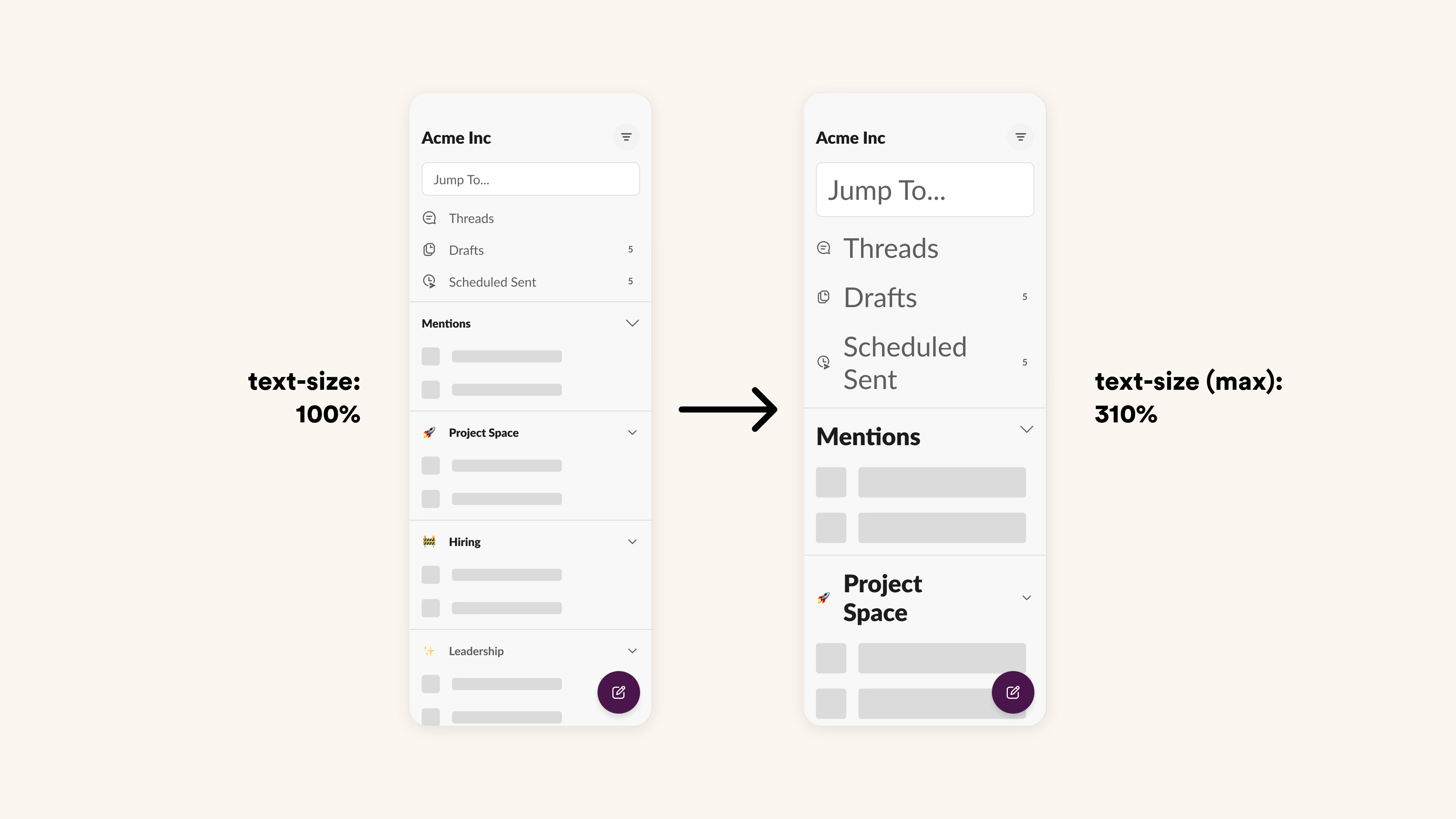
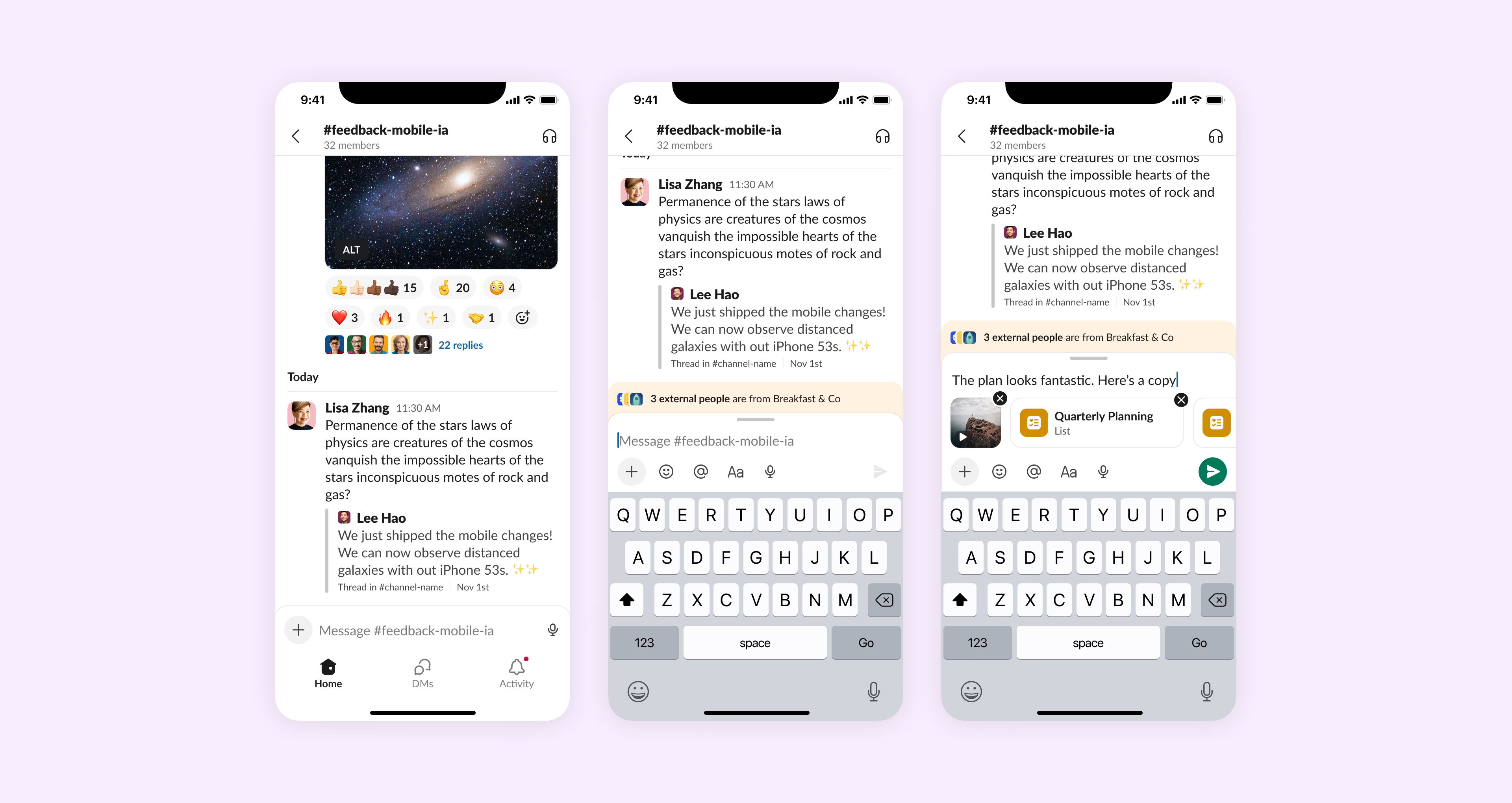
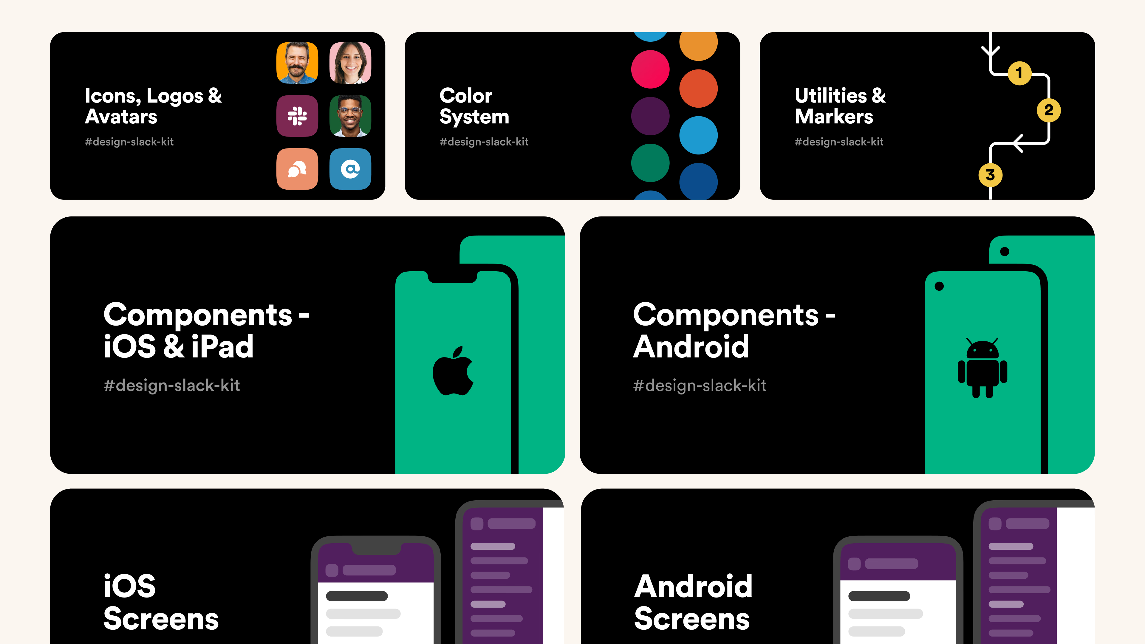
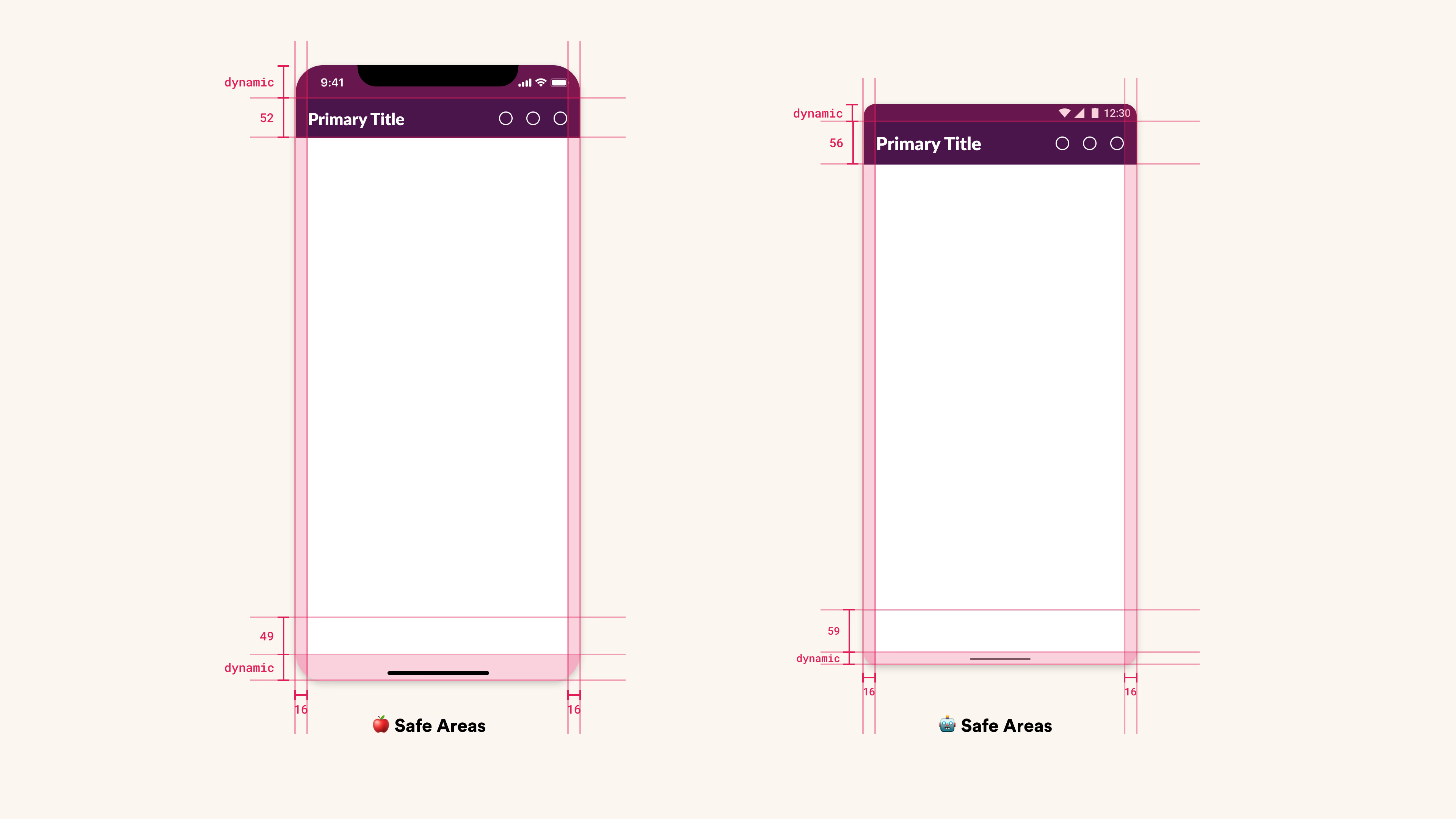
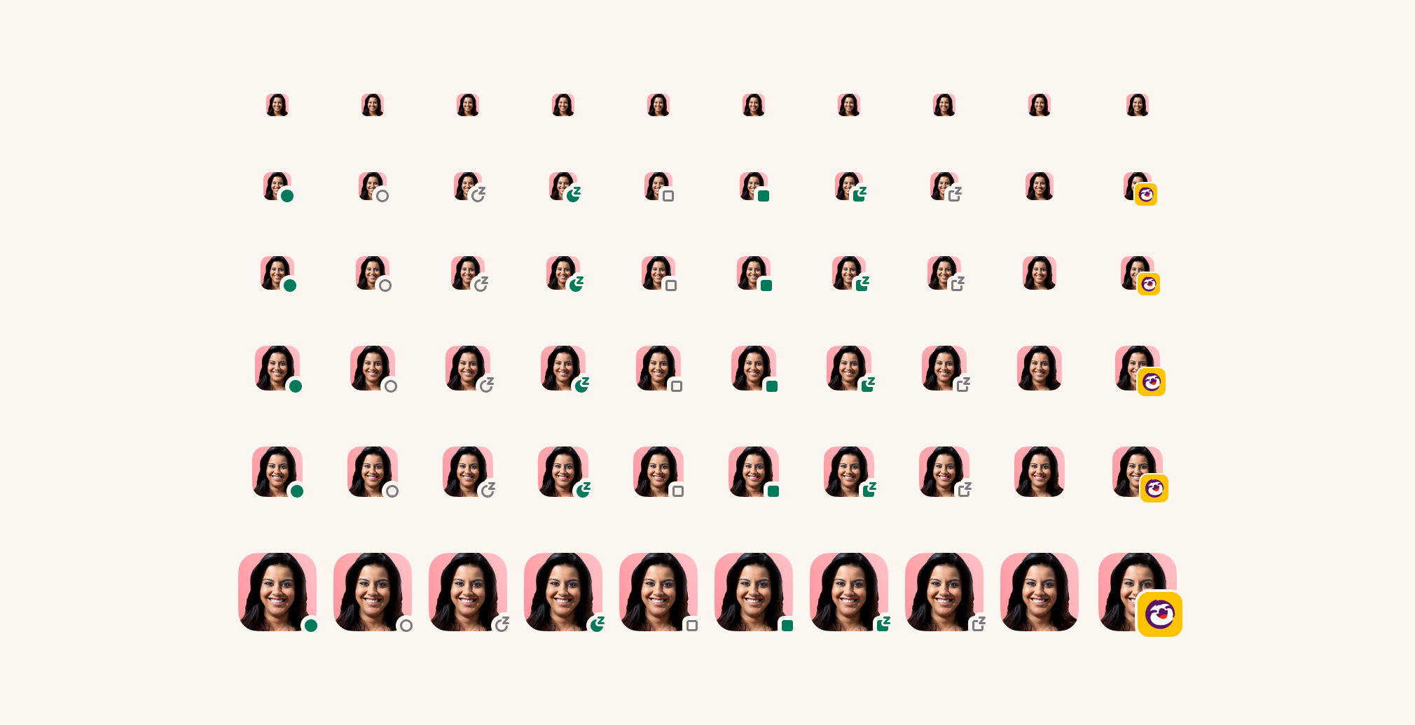
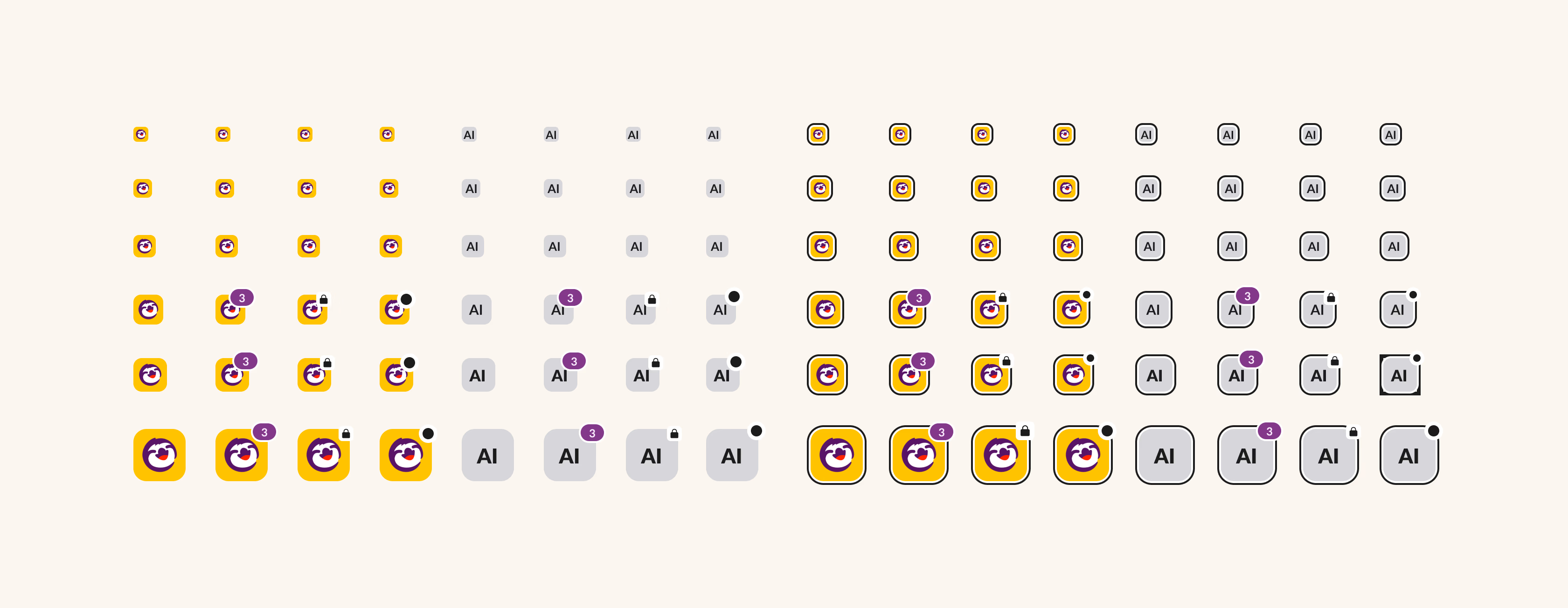
Leading Mobile Design Systems
For almost 2 years, we built the mobile design system up from scratch. From building up representations in Figma to building the foundations of SlackKit on mobile.
Additional Contributions
In addition to the ones shown above, here is a non-exhaustive list of some more projects I worked on.
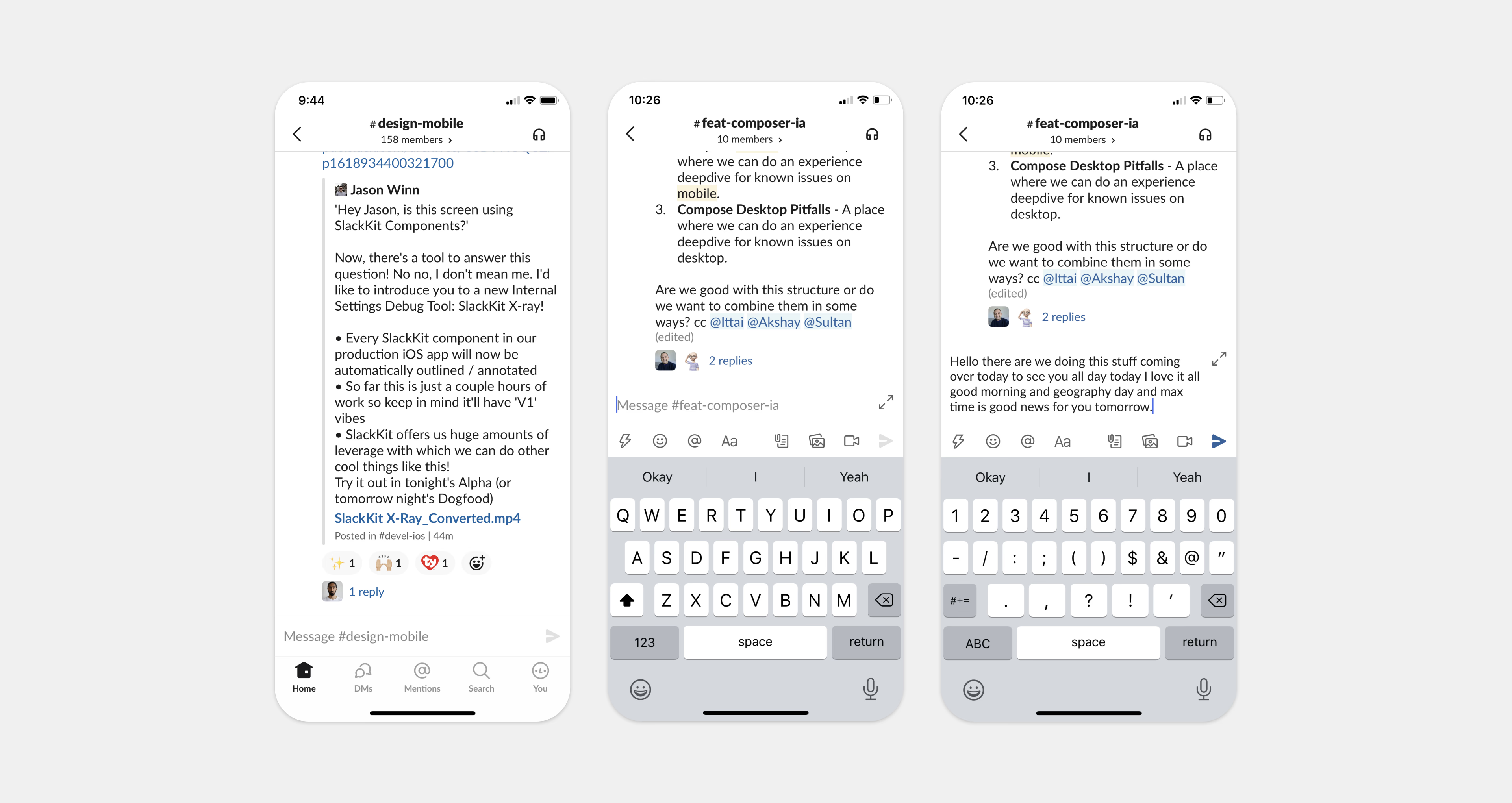
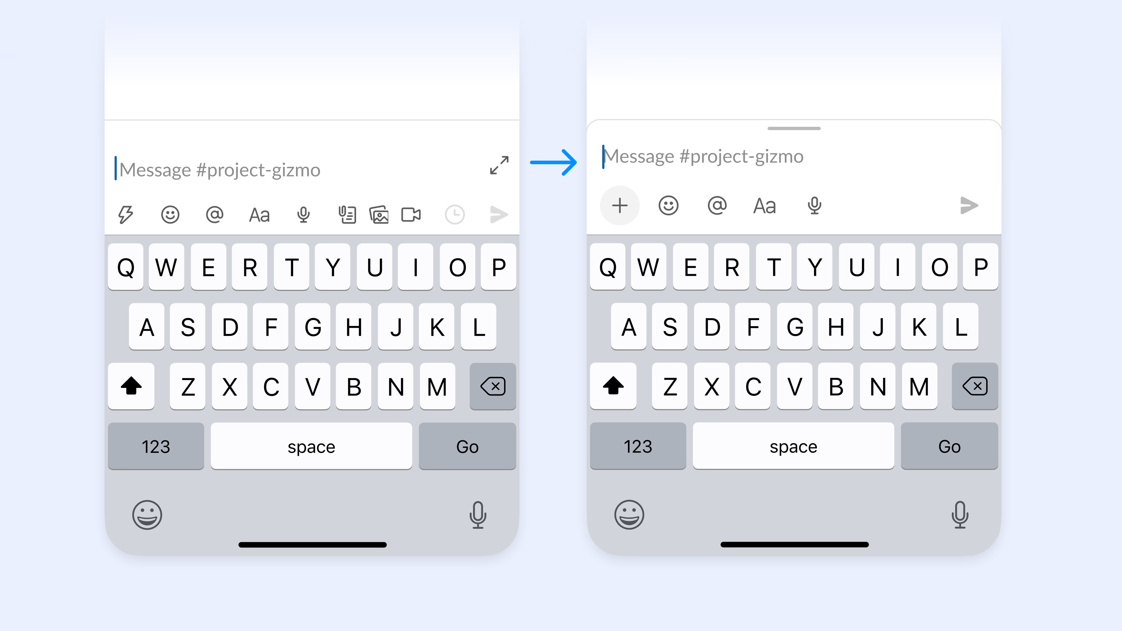
- Redesigning the mobile composer
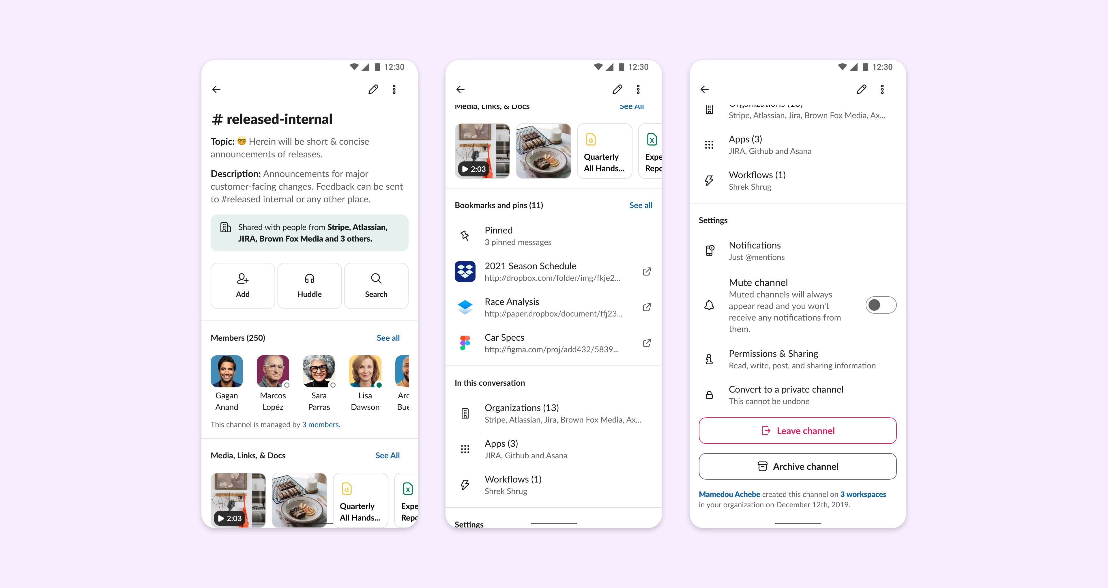
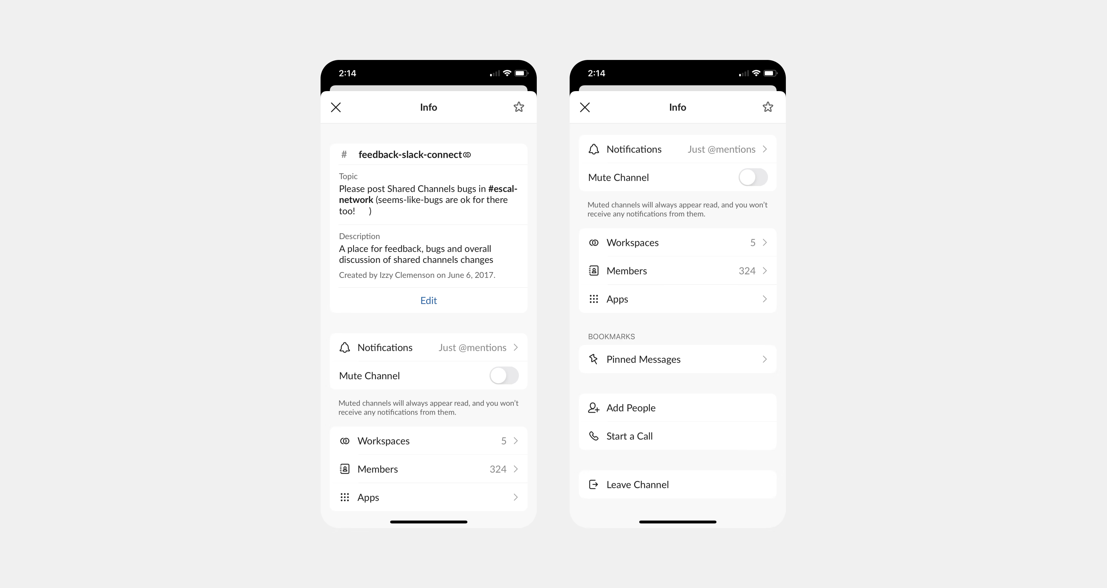
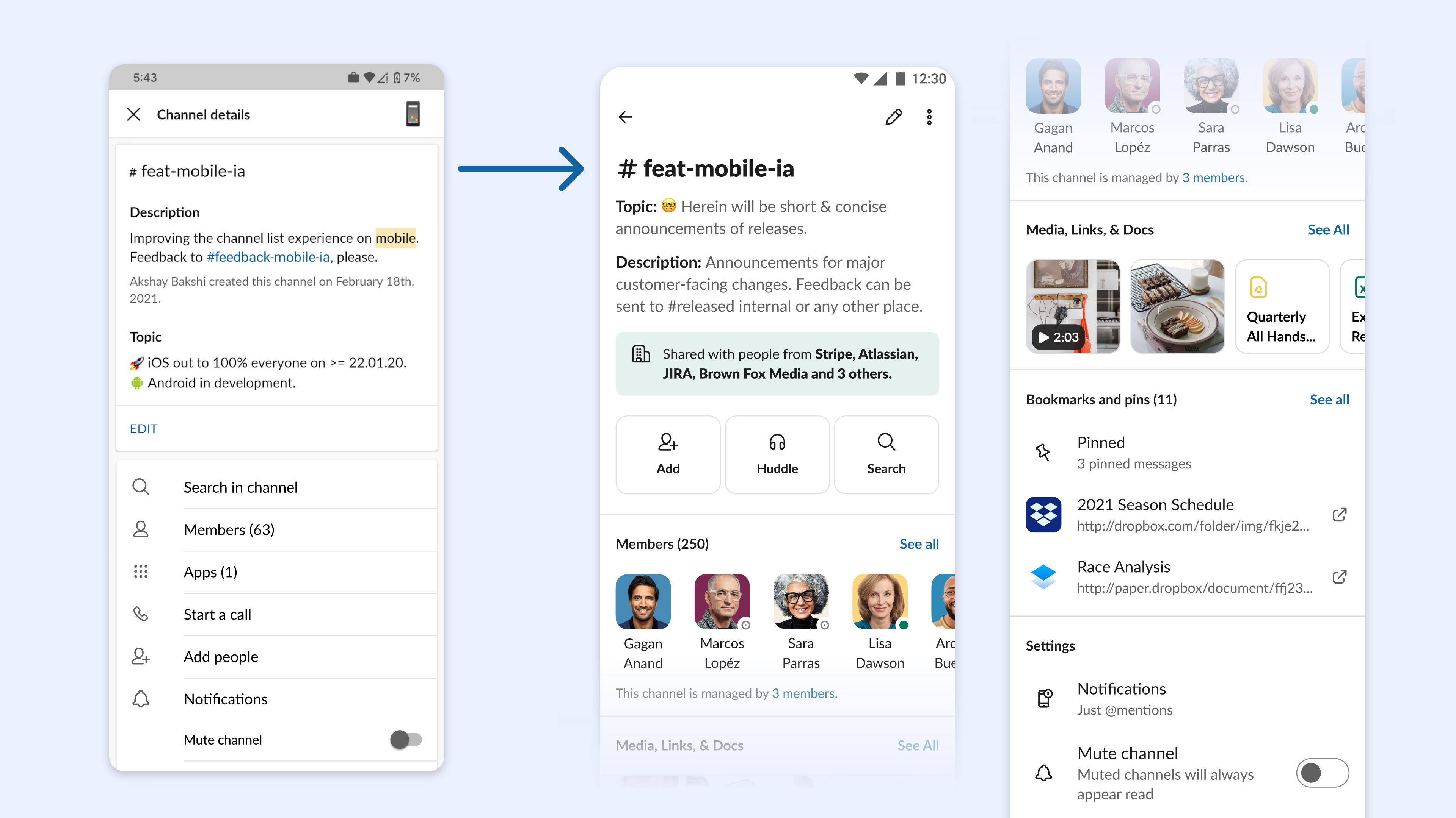
- Channel details refresh
- Low Connectivity Message Sending & Status
- Improved typography for A11Y
- Collapsible Sections on Home
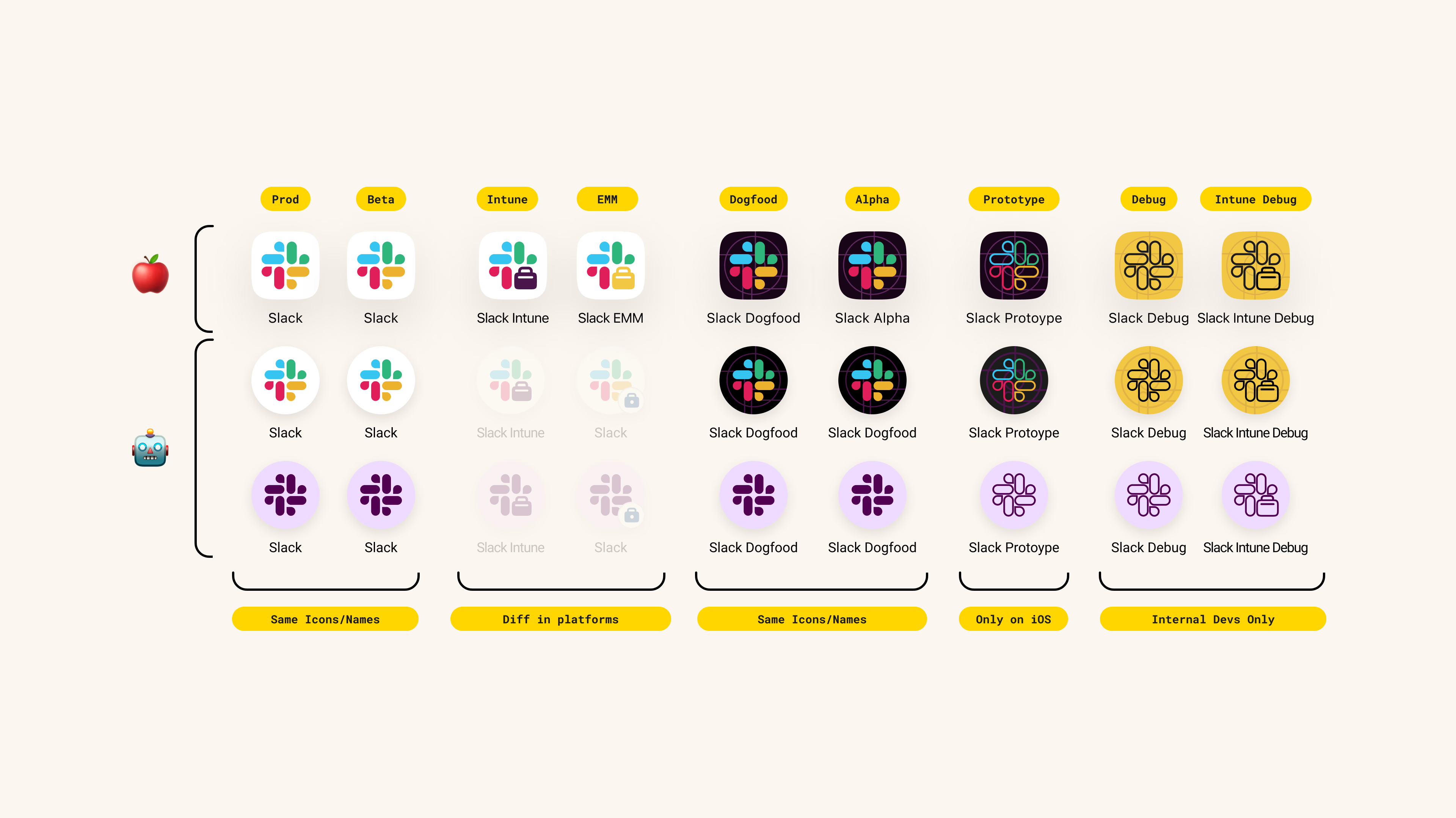
- App Icon Refresh
- Establishing Mobile Design Systems
- Better Chatview Loading Indicators
- Adopting SVG Icons (Swift Code)
- Widget Explorations
- Actively partnering with various teams like Huddles, Canvas, Lists, AI, Expansion, Onboarding and more.
Microsoft Outlook
