Microsoft 365
Visual Design / Future / Productivity
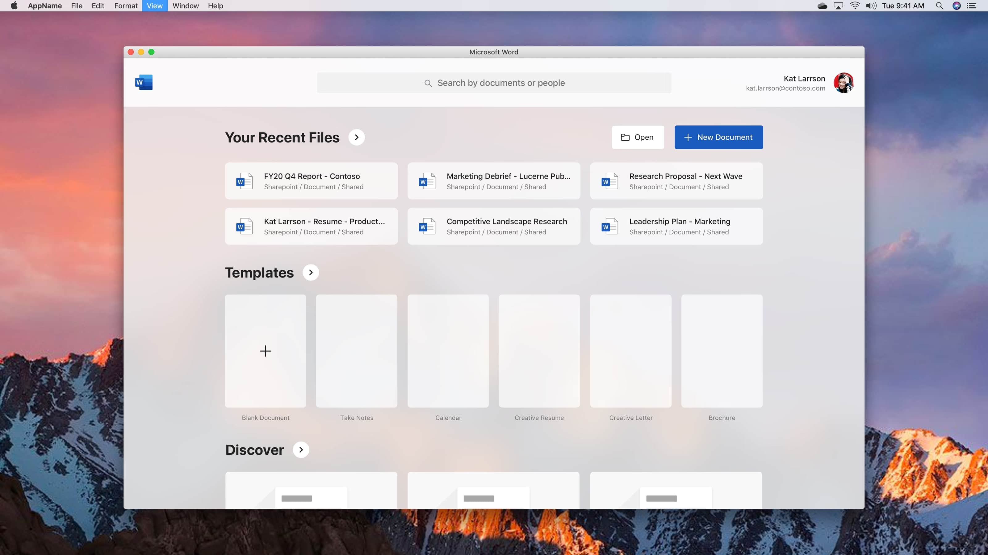
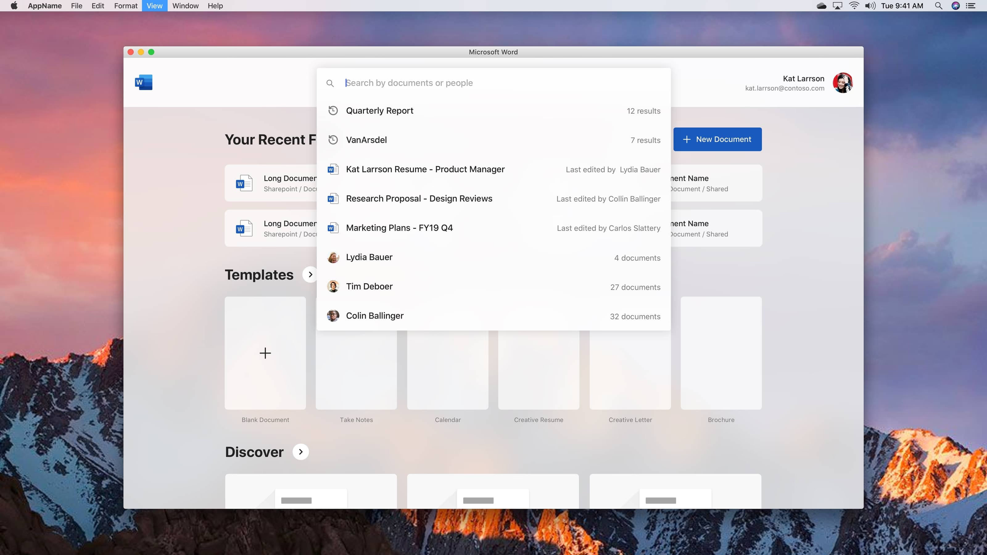
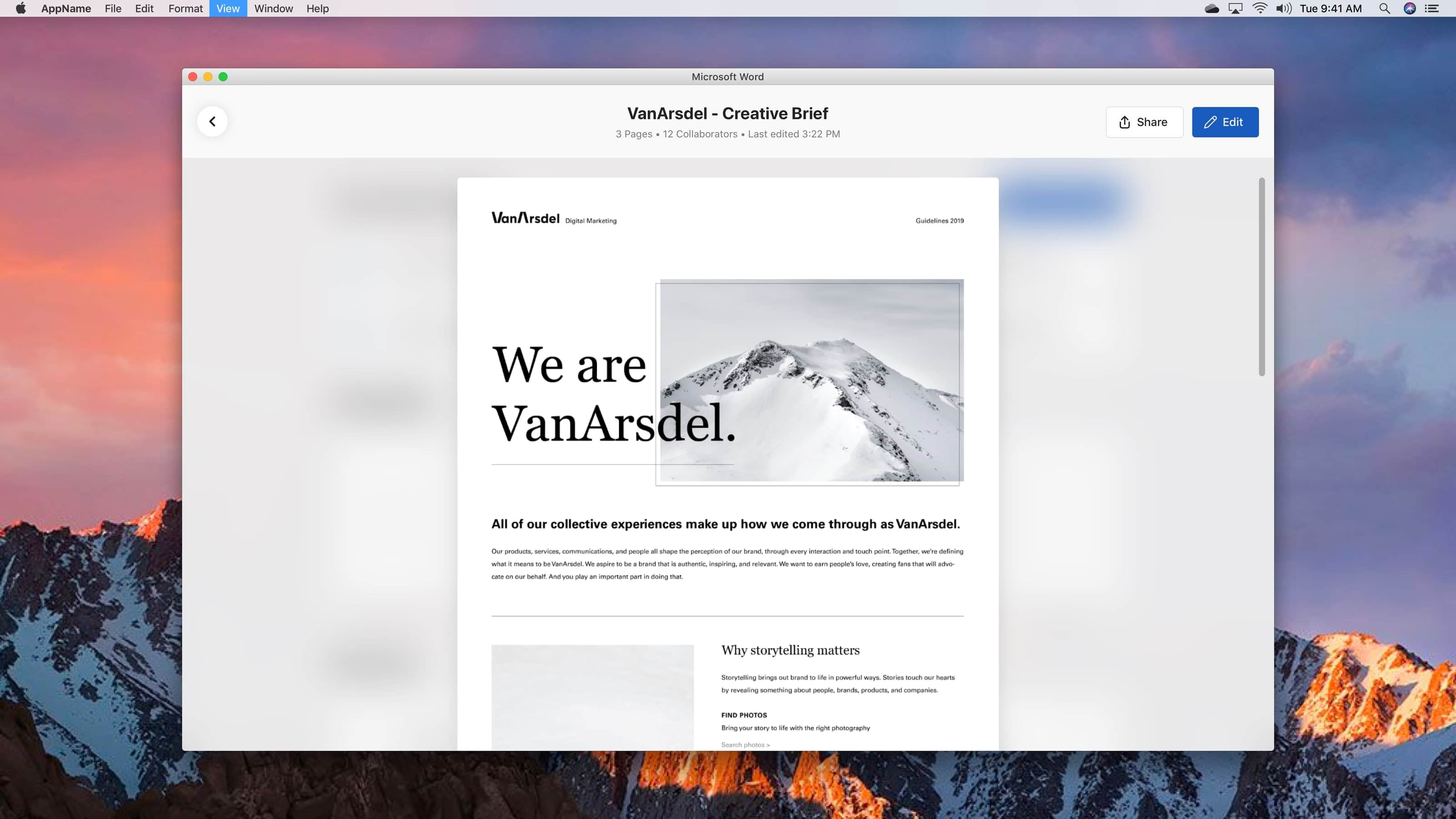
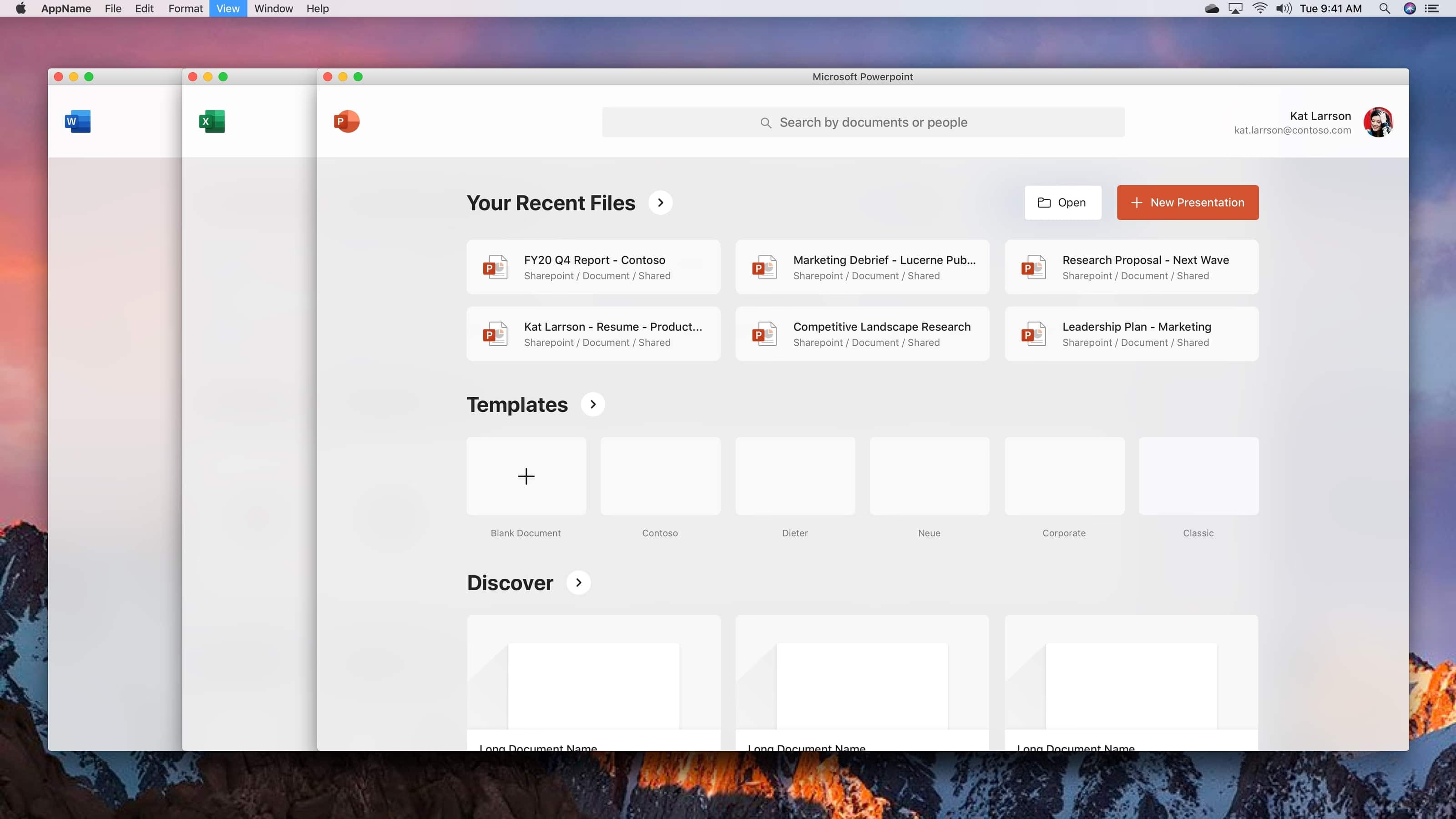
What if Microsoft 365 looked different?
Personal Goal: In 2020, I re-designed a few Microsoft products to learn about grids, typography and visual balance. One of the projects I worked on, was a redesign of the Office apps on MacOS.
Re-imagining Microsoft Office for MacOS: The current Office suite, while powerful and feature-rich, often feels cluttered and overwhelming. My exploration focused on creating a more streamlined, modern interface that prioritizes content and reduces cognitive load.
Design Philosophy: Inspired by Fluent Design principles, I aimed to create interfaces that feel more intuitive, visually appealing, and aligned with modern design trends. The goal was to maintain functionality while significantly improving the user experience through better visual hierarchy and cleaner layouts.
Microsoft Graph Integration: These designs explore how leveraging Microsoft Graph could provide more intelligent, contextual experiences that adapt to user behavior and preferences.
⚠️ Caveat: Note that this is purely a personal project, and a visual design project for practice only.
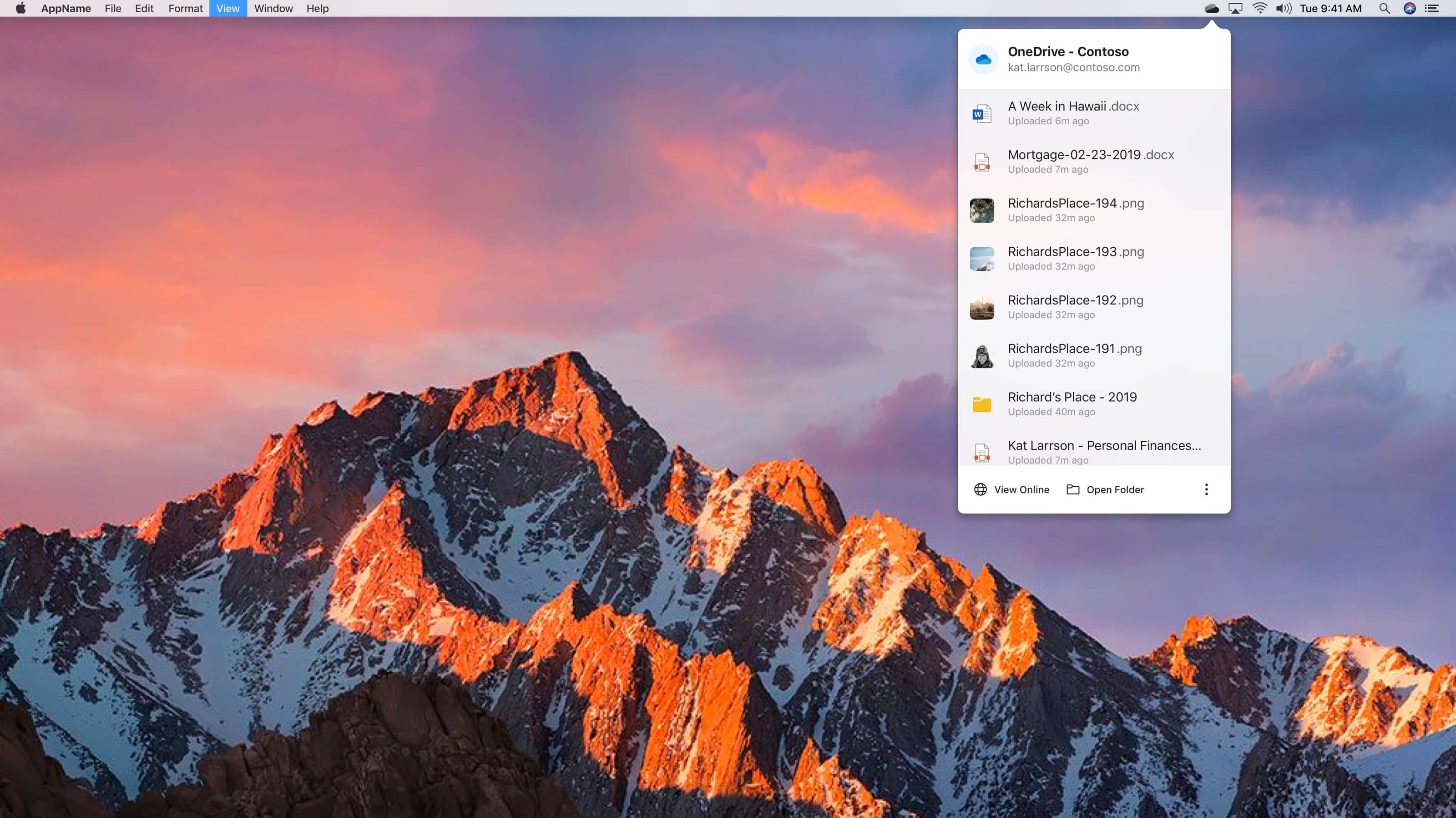
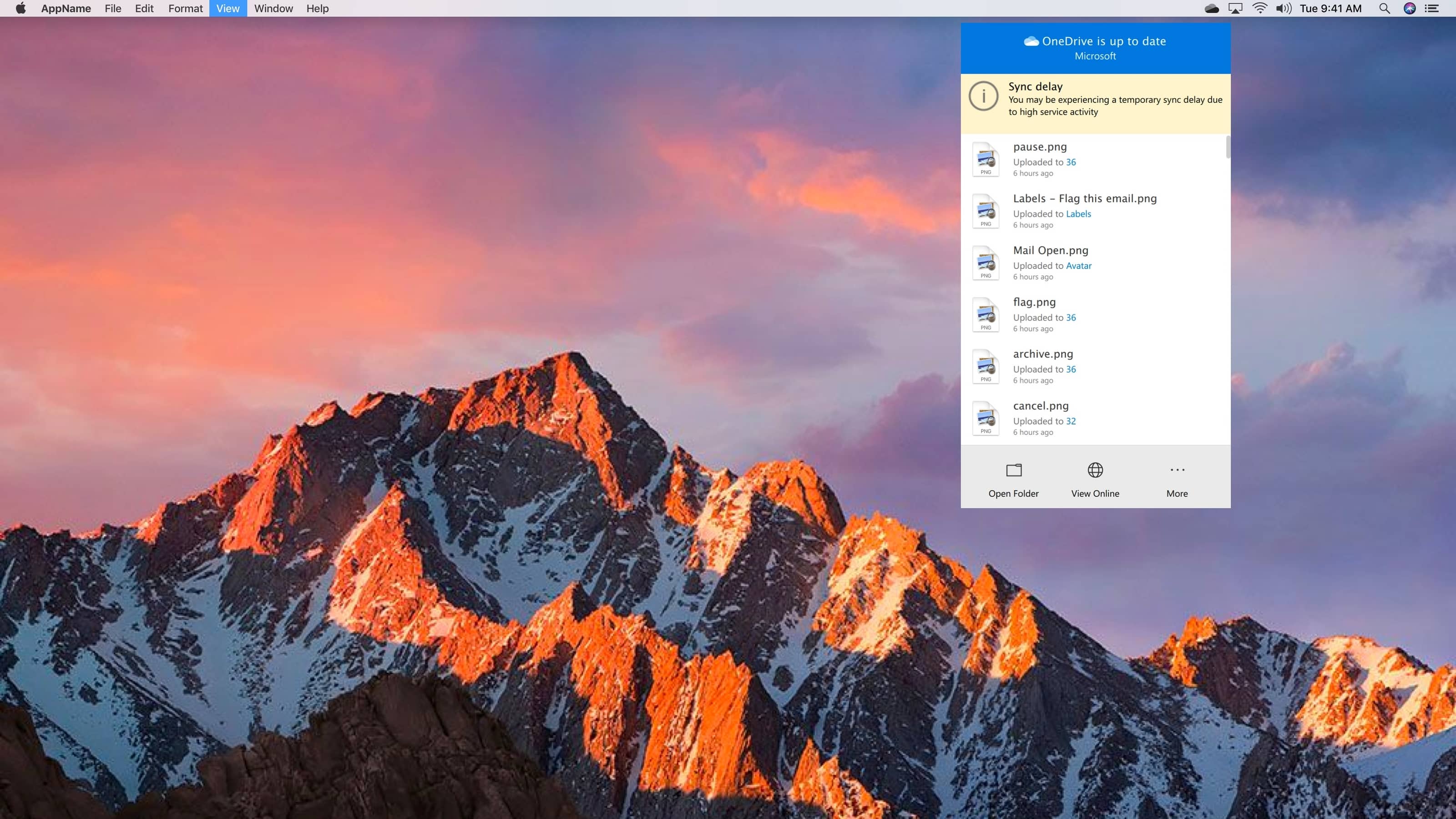
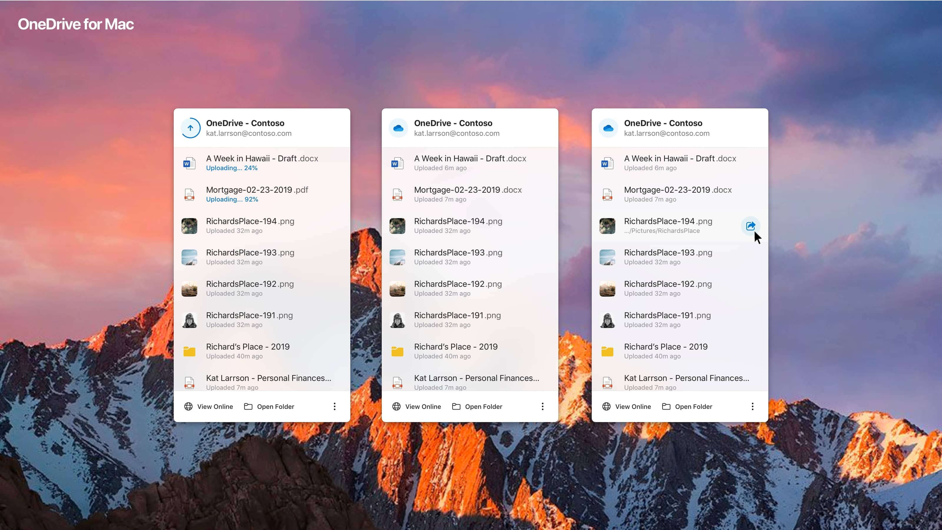
OneDrive Toolbar for MacOS
Personal Goal: In addition, I also took the challenge to explore new ideas for OneDrive's Mac tool to sync cloud-based files.
Using Mobile Components: These designs were also inspired by Fluent design, where I re-purposed our Mobile toolkit elements for OneDrive as a test of their versatility. They were well-received by the OneDrive team.
Design Approach: The goal was to create a more intuitive and visually appealing file management experience that feels native to MacOS while incorporating modern design patterns from mobile interfaces.